
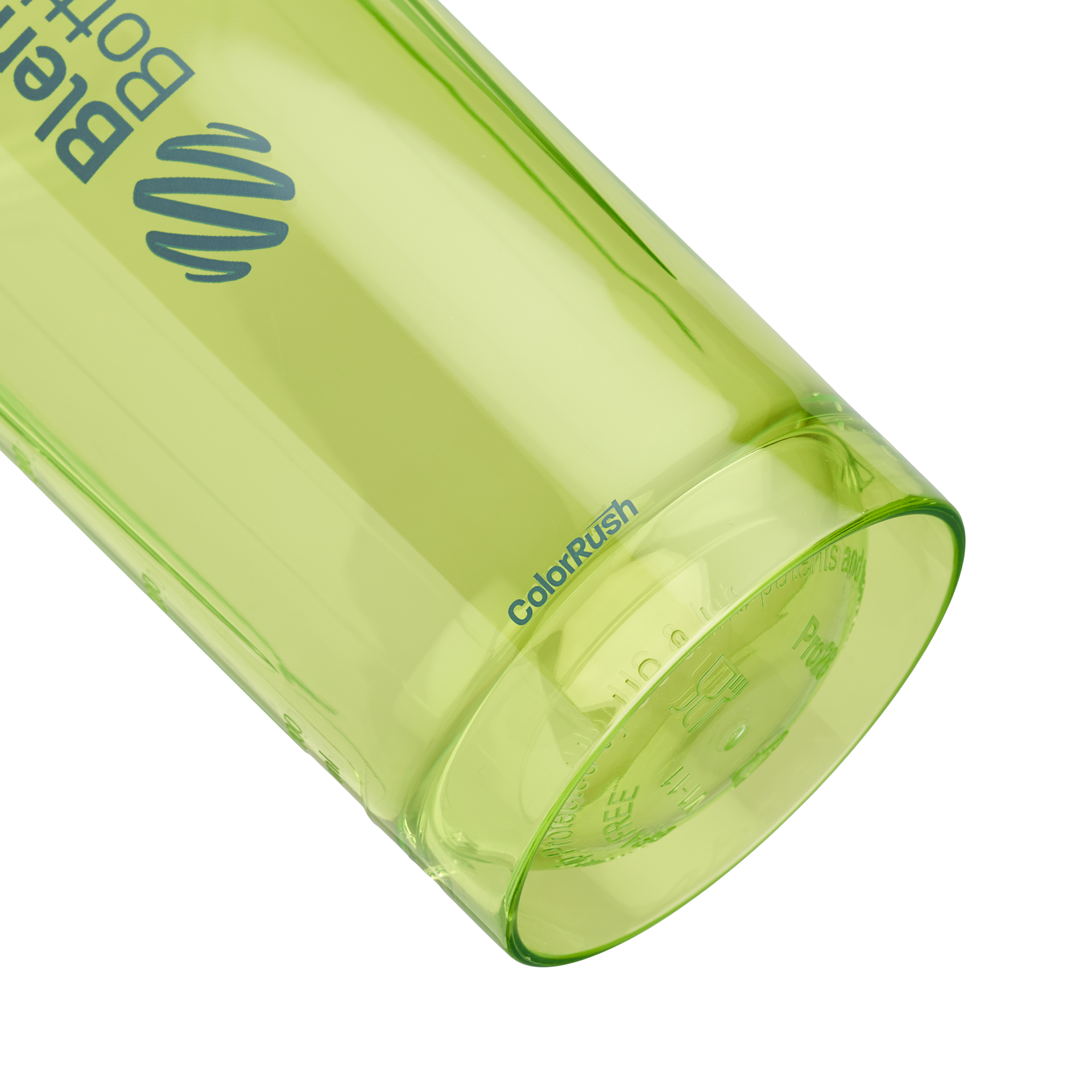
Color Rush
Project Goal:
To capture the Color Rush program's vibrant energy and collectible nature through bold, eye-catching visuals highlighting each month's unique color combinations. Also, to showcase the excitement of limited-edition drops and spotlight the range of BlenderBottle product styles—going beyond the Classic—to help educate users on the full lineup.
Introduction
The Color Rush Program was created to reinvigorate BlenderBottle’s monthly subscription program through a series of limited-edition bottle drops that create excitement, drive engagement, and build a sense of collectibility. Alongside bold and exciting color combinations, the program also serves as a strategic tool to educate our community about the full BlenderBottle product lineup. By featuring a variety of bottle styles—not just the well-known Classic—we aim to expand consumer awareness, showcase the unique benefits of each design, and strengthen brand loyalty through both form and function.
I was key in bringing this launch to life, overseeing art direction from early concept through final rollout. This included developing internal presentation materials, developing the branding for the program, hiring talent, and directing the photoshoot and launch video. I also designed the final marketing assets, including the program logo and bottle naming structure, to ensure a consistent and impactful debut across all platforms.


Research & Strategy
Color Rush was designed with our most loyal customers in mind—specifically, our Bottle of the Month subscribers who were previously receiving exclusive Classic bottles on a monthly basis. With this new program, subscribers gain access to a wider variety of bottle styles in limited-edition colorways, following the popular “drop” model seen in streetwear and sneaker culture.
This shift was made not only to reinvigorate the subscription experience but also to better serve a customer base that values both performance and personal style. These consumers are highly engaged: over 70% report using their bottles daily, and nearly 60% say they match their fitness accessories to their outfits as part of their active lifestyle. By offering rare color combinations and expanding beyond the Classic, Color Rush taps into the intersection of function and fashion—giving users more ways to express themselves while staying hydrated and motivated.
Concept & Mood
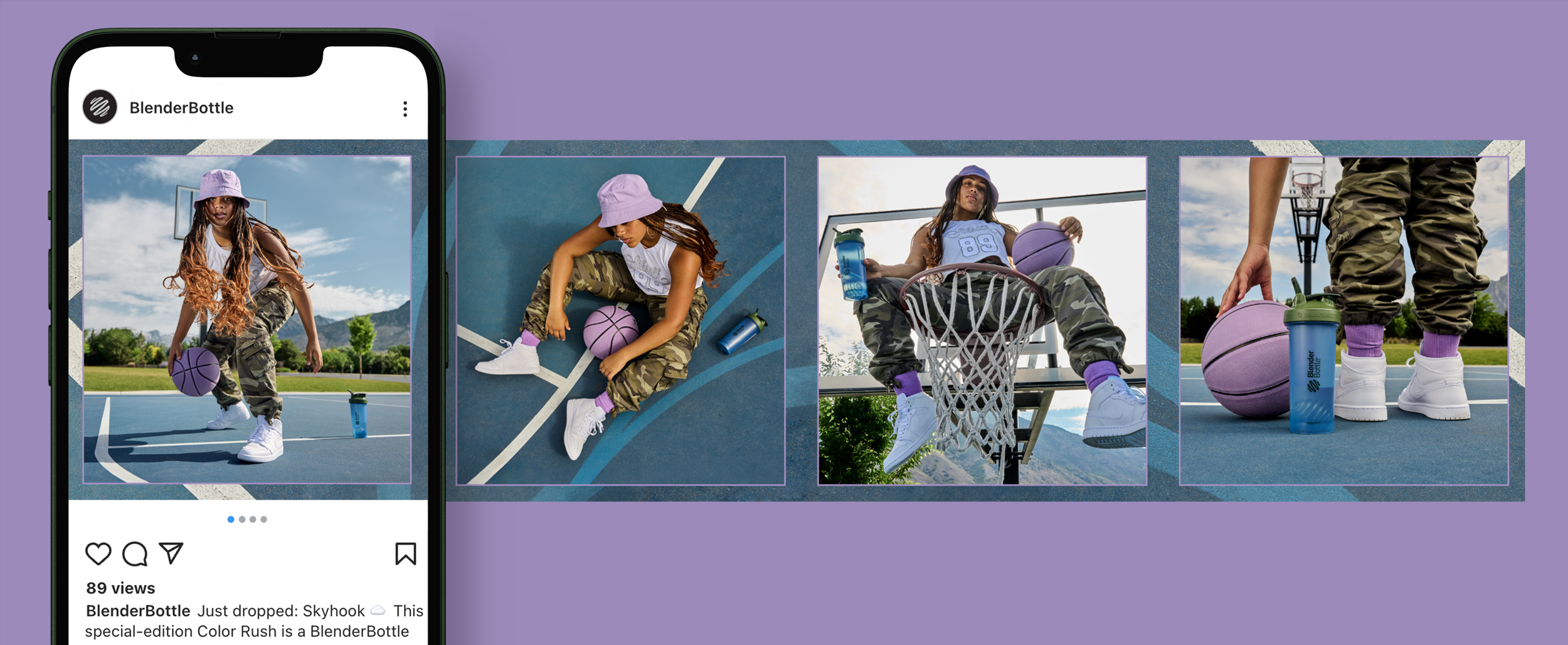
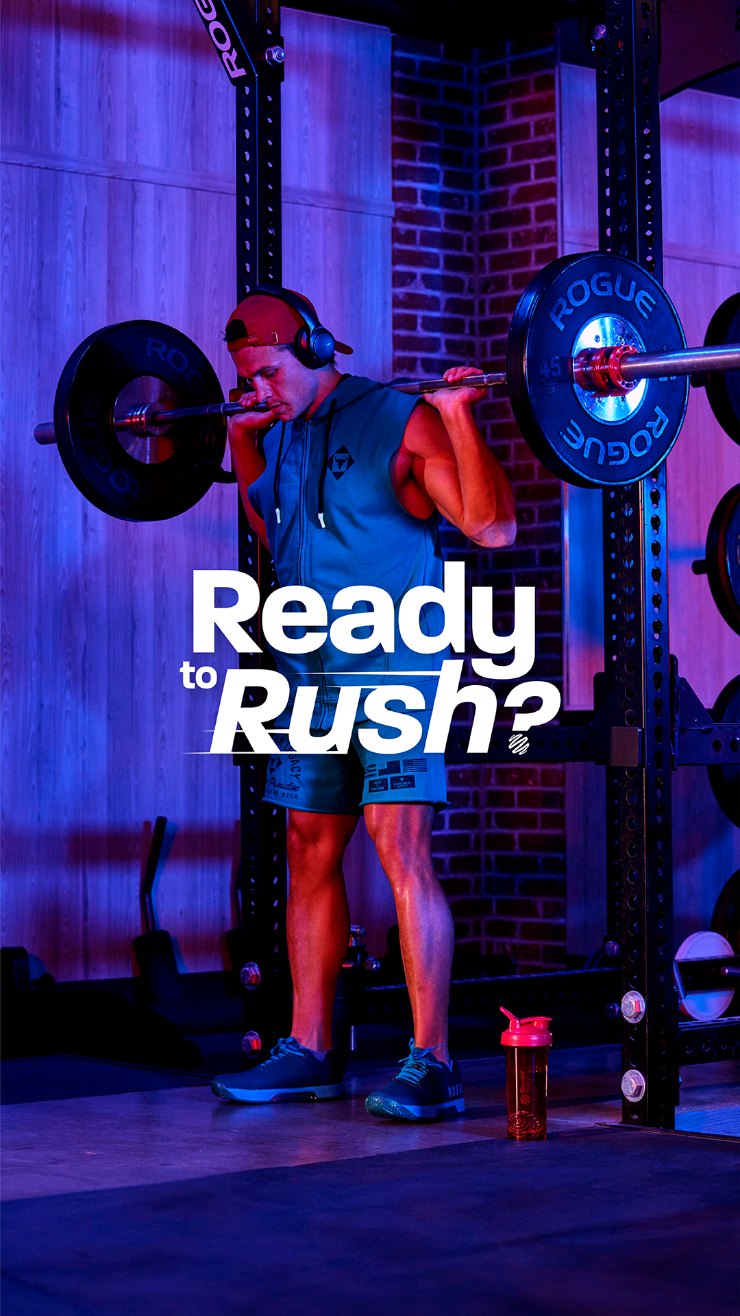
For the Color Rush shoot, the goal was to create vibrant, stylized environments that reflect the energy and individuality of each limited-edition bottle. Each setup paired a bold bottle colorway with a distinct fitness activity, using contrasting colors, curated locations, and coordinated wardrobes to craft visually dynamic scenes.


The visual strategy emphasized motion, personality, and color as a driving force—both in stills and video. In the video concept, the bottle acts as the catalyst, bringing the scene into vivid focus and delivering the "rush" of energy the athlete needs to elevate their performance.
Photoshoot & Art Direction
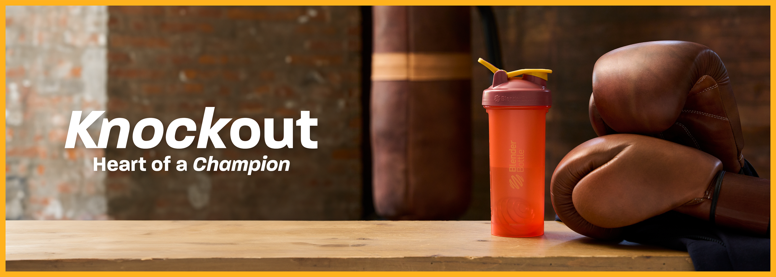
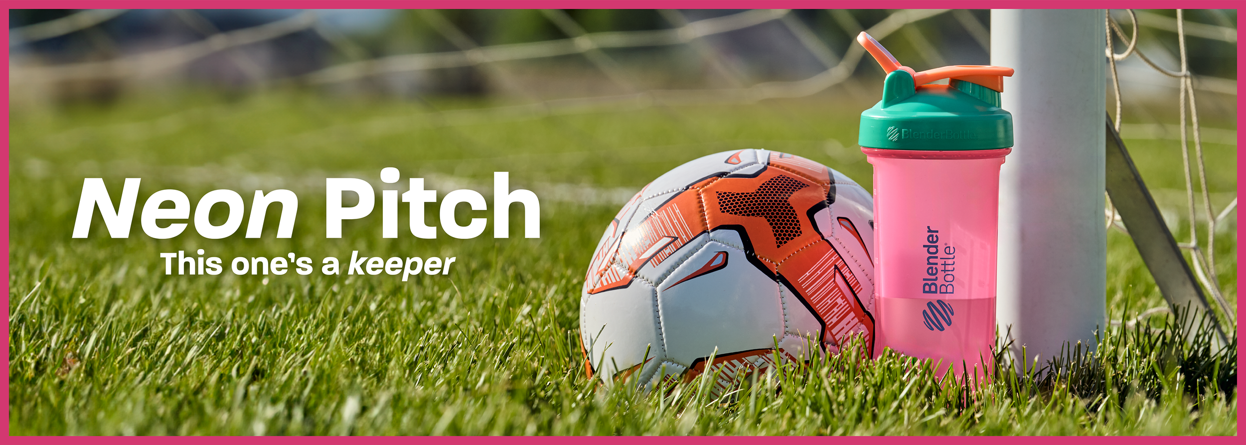
This campaign drew inspiration from the bold, fashion-forward potential of BlenderBottle’s vibrant color lineup—treating each bottle as more than just a fitness essential, but as a statement accessory. Over six shoot days with seven diverse models, we built a series of micro-environments tailored to each bottle color. Contrasting backdrops and props were chosen to make the hues pop, while each scene was matched to a specific sport or activity that resonated with our audience. The lineup spanned tennis, running, yoga, lifting, boxing, basketball, soccer, and barre/dance, ensuring a wide appeal and visual variety.
Movement was central to the creative direction. High-energy, in-action shots captured the “rush” of a workout, while more composed moments reflected the satisfaction and fulfillment that follows. This balance of motion and stillness enabled us to present both performance and lifestyle in a cohesive visual narrative.
Wardrobe and styling were a collaborative effort between myself, our social media specialist, and the models. Outfits were selected to complement each bottle’s color and the sport being depicted, blending functionality with style. Every look felt authentic to the activity while still standing out as something you’d want to wear both on and off the court, field, or studio. I sourced all outfits and props to align with the creative vision and maintain consistency across the campaign.
The result was a vibrant, energetic series that seamlessly merged fitness, fashion, and personality—positioning BlenderBottle not only as a leader in performance, but also as a brand that celebrates self-expression through color and movement.

These mood boards served as high-level concept references to establish the color palette, fitness activity, and wardrobe direction for each individual shoot. Each slide represented a half-day session with a different model, scheduled across a six-day production timeline.
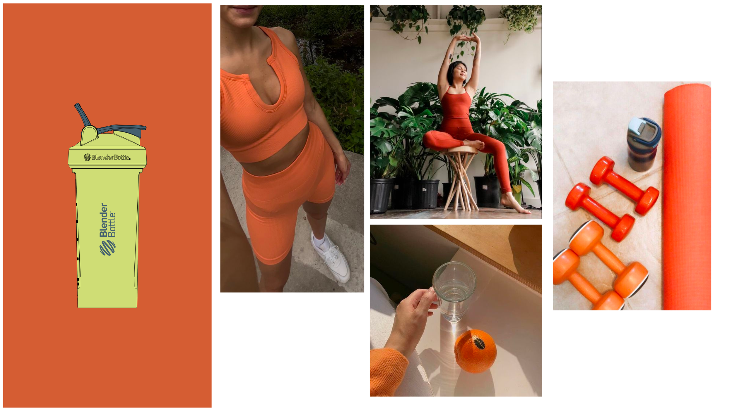
These mood boards served as high-level concept references to establish the color palette, fitness activity, and wardrobe direction for each individual shoot. Each slide represented a half-day session with a different model, scheduled across a six-day production timeline.

These mood boards served as high-level concept references to establish the color palette, fitness activity, and wardrobe direction for each individual shoot. Each slide represented a half-day session with a different model, scheduled across a six-day production timeline.

These mood boards served as high-level concept references to establish the color palette, fitness activity, and wardrobe direction for each individual shoot. Each slide represented a half-day session with a different model, scheduled across a six-day production timeline.

These mood boards served as high-level concept references to establish the color palette, fitness activity, and wardrobe direction for each individual shoot. Each slide represented a half-day session with a different model, scheduled across a six-day production timeline.

These mood boards served as high-level concept references to establish the color palette, fitness activity, and wardrobe direction for each individual shoot. Each slide represented a half-day session with a different model, scheduled across a six-day production timeline.

These mood boards served as high-level concept references to establish the color palette, fitness activity, and wardrobe direction for each individual shoot. Each slide represented a half-day session with a different model, scheduled across a six-day production timeline.

These mood boards served as high-level concept references to establish the color palette, fitness activity, and wardrobe direction for each individual shoot. Each slide represented a half-day session with a different model, scheduled across a six-day production timeline.

These mood boards served as high-level concept references to establish the color palette, fitness activity, and wardrobe direction for each individual shoot. Each slide represented a half-day session with a different model, scheduled across a six-day production timeline.
Design Execution
The final design approach leveraged the bold color palette and diverse imagery to create a cohesive, sport-driven narrative. Bottle names and taglines were intentionally paired with each sport to reinforce the theme, while a consistent layout across all launches ensured visual unity. For each campaign, similar sport-specific shots were repurposed to announce launches and “sold out” moments, creating a recognizable and repeatable visual language for the series.
I created a full suite of digital assets including email graphics, social media content, Pinterest ads, Facebook and Instagram placements, and banners for both desktop and mobile. I also contributed to art direction for the launch video and individual bottle videos, ensuring consistency across motion and static content. Additionally, I handled all post-processing of campaign images—color correcting, retouching, cropping, and preparing final exports for use across the company’s platforms.


Project Result:
The launches were a success—many bottles sold out within days, and the vibrant campaign visuals dominated our social channels as the top-performing content of the entire year. The response proved that bold color and personality-driven storytelling can spark both excitement and sales, setting a new creative benchmark for future launches.
The Team:
Art Director: Stauney Hansen
Creative Media Director: Evett Rolsten
Producer: Richie Jacobson
Director of Photography: Riley Sorenson, Evett Rolsten, Assistant DP: Sam Wood
Lead Photographer: Blake Tolley, Assistant Photo: Luke Tolley
Grip: Luke Tolley, Genji Li, Gaffer: Tyler Davies
Wardrobe Stylist: Stauney Hansen, Kristina Padgett
Talent: Willow Corner, Jentz Painter, Audrey Painter, Hannah Willis, Christian Hall, Tiffany Pao Higuchi, Taylor Mafileo
Video Editor: Garrett Elton, Jordan Boren
Locations: Lehi Sports Complex, Lehi, UT. American Fork High School, American Fork, UT. U West Studios, Salt Lake City, UT. The Loft Studio, Lehi, UT. Harvey Park, Pleasant Grove, UT. Trove Brands Gym, Lehi, UT.