
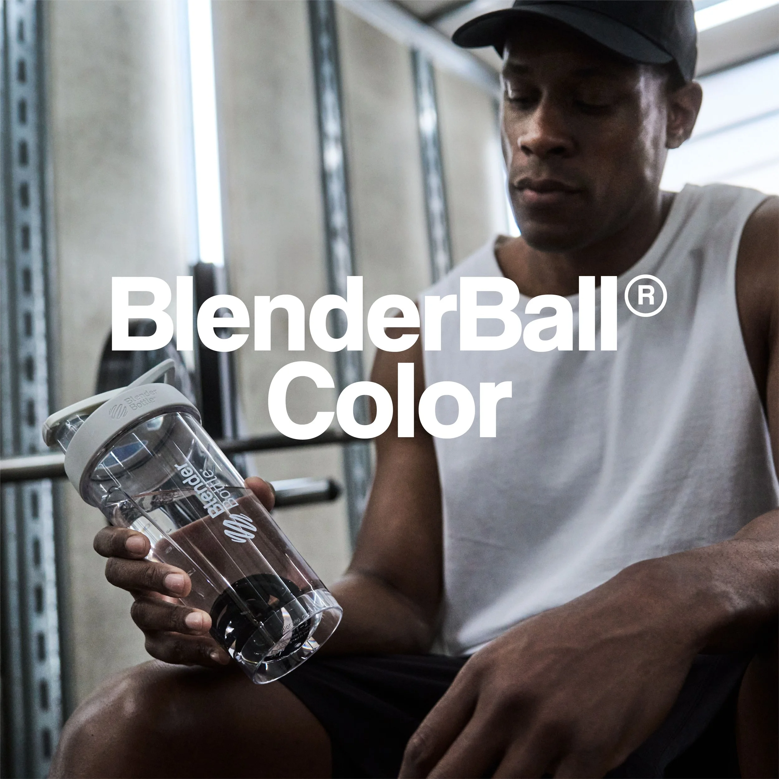
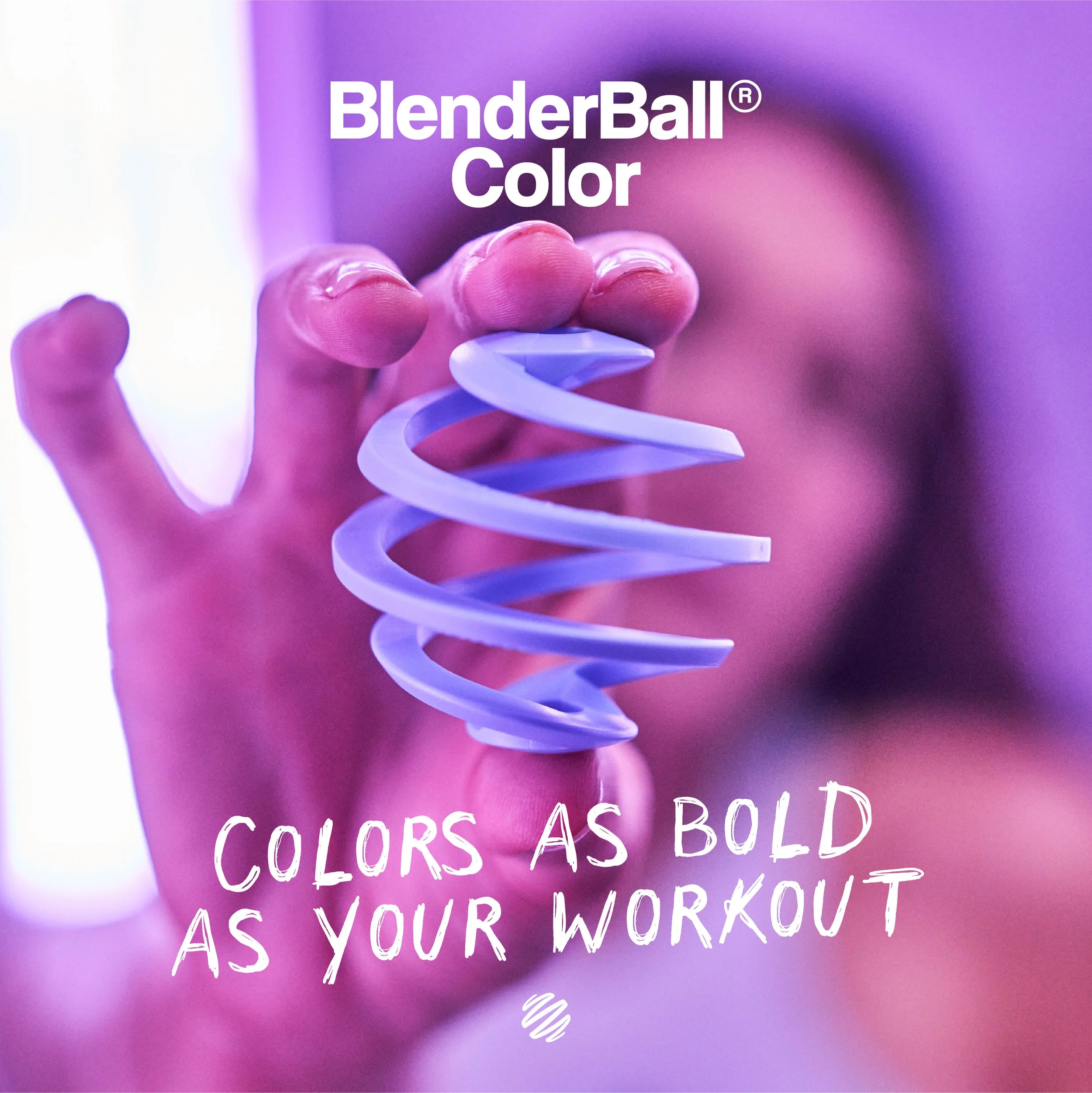
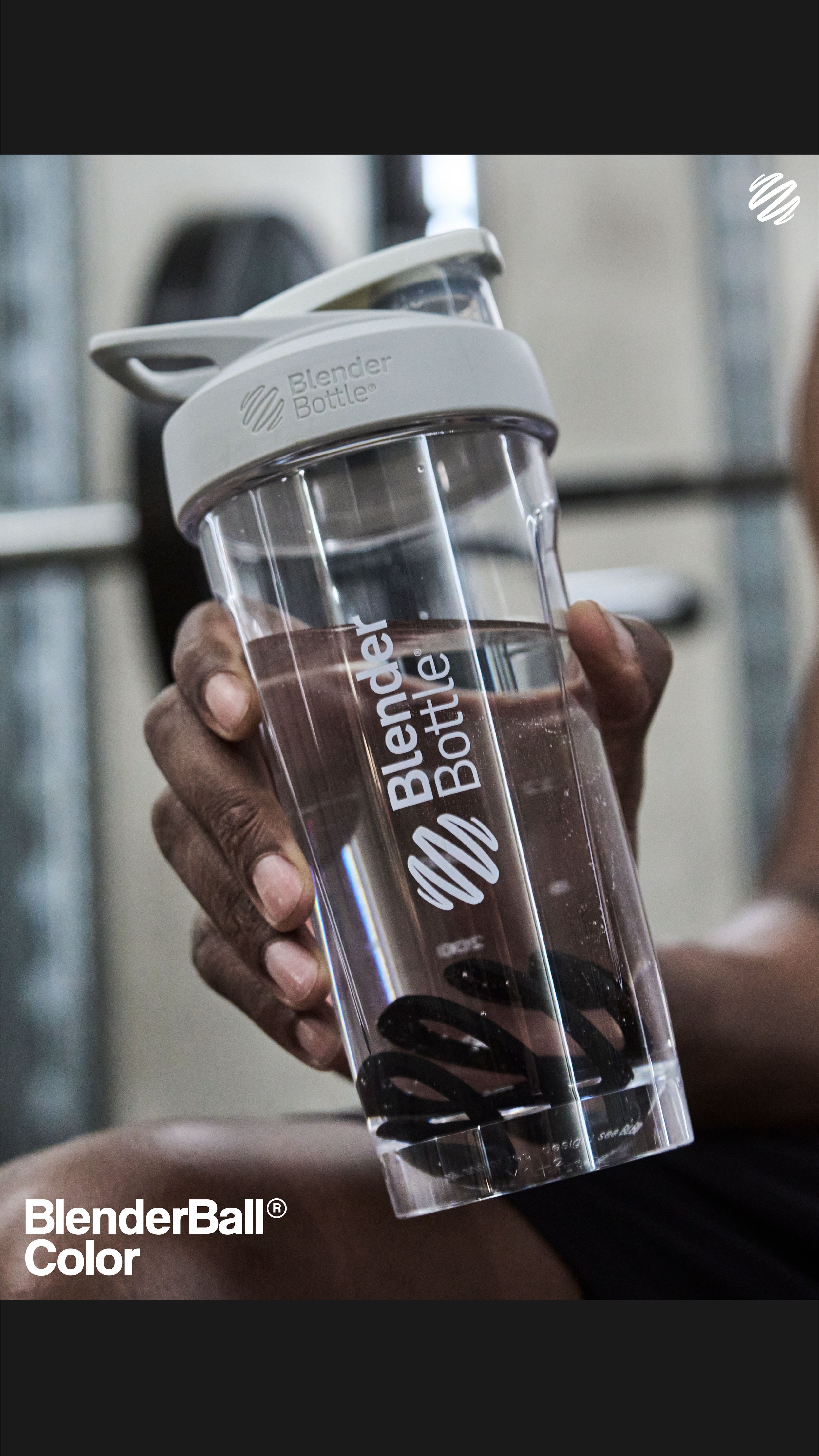
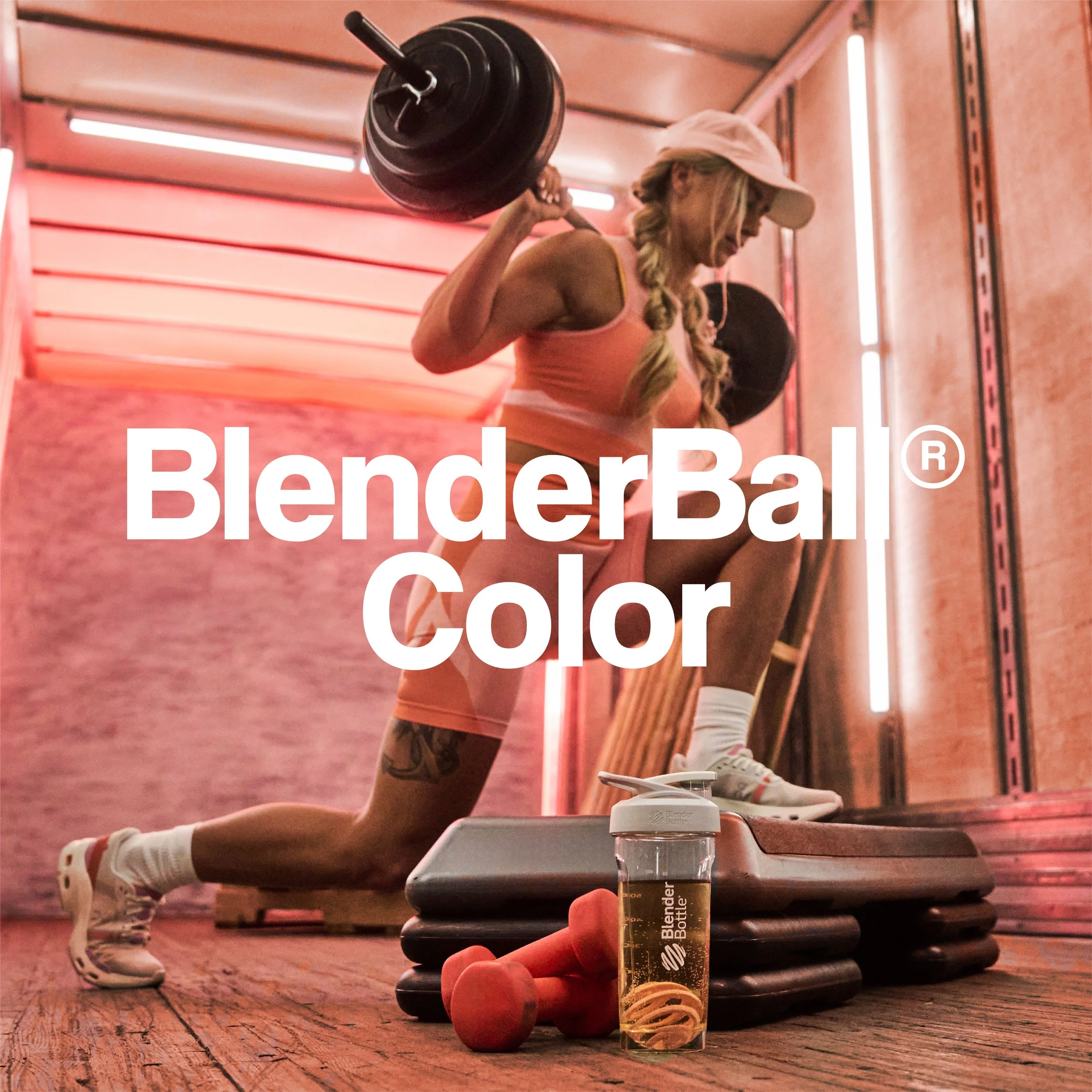
BlenderBall Color
Project Goal:
To support the launch of BlenderBall Color—BlenderBottle’s first innovation to the patented BlenderBall design—and communicate the whisk’s trusted technology, now available with bold, expressive colorways that empower users to personalize their bottles without compromising performance.
Introduction
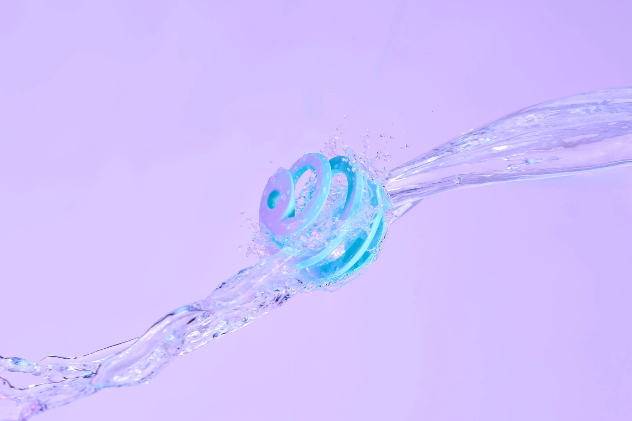
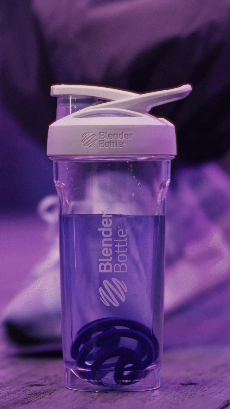
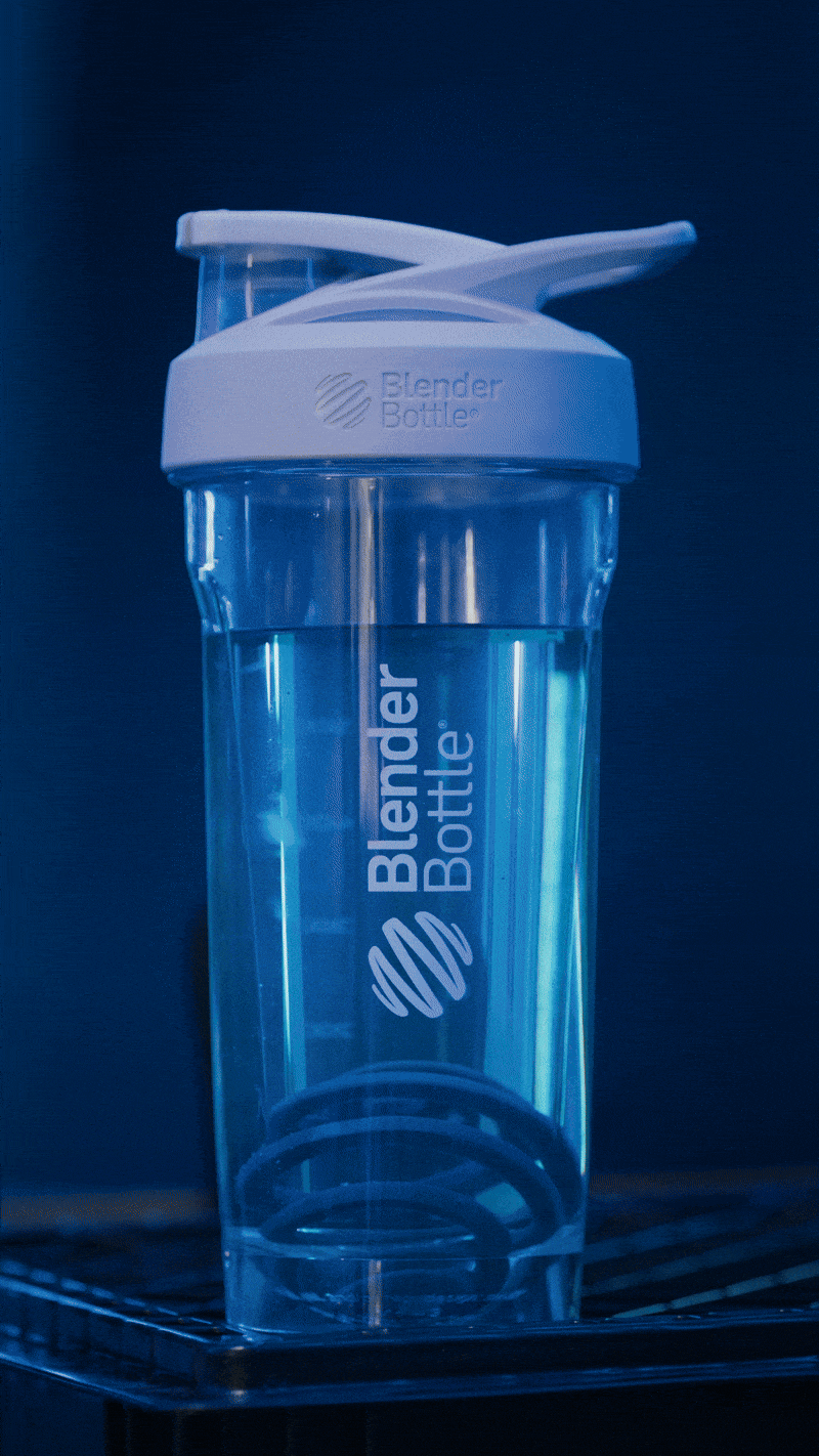
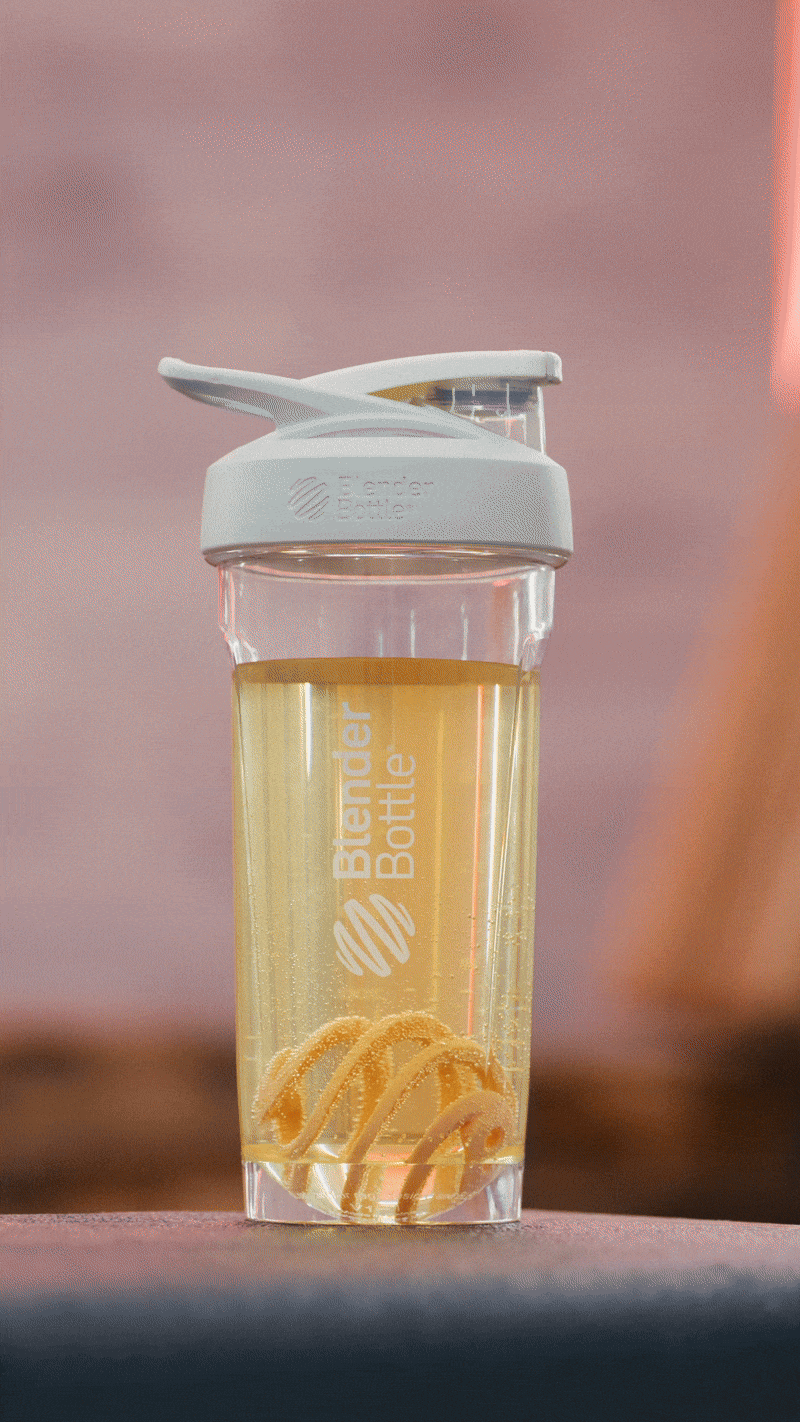
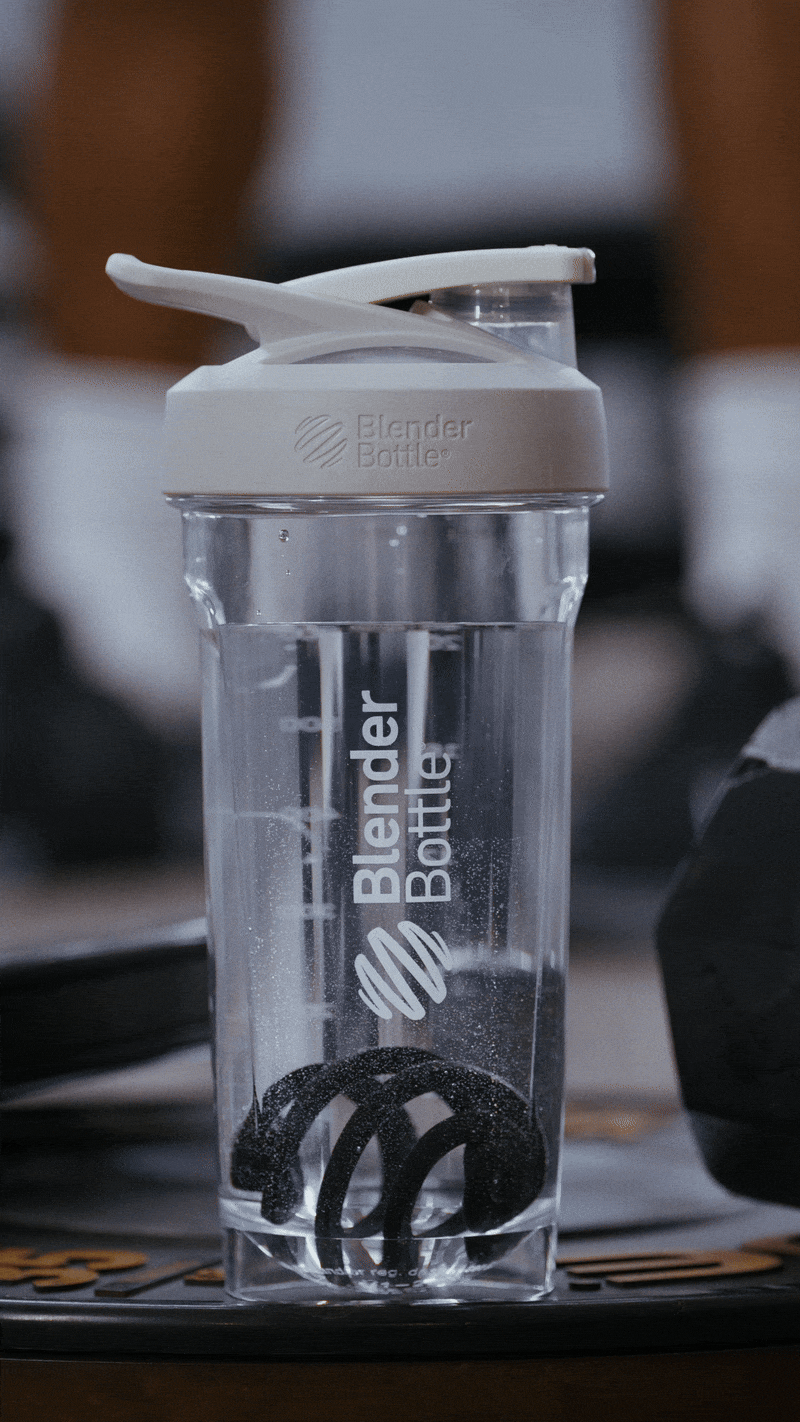
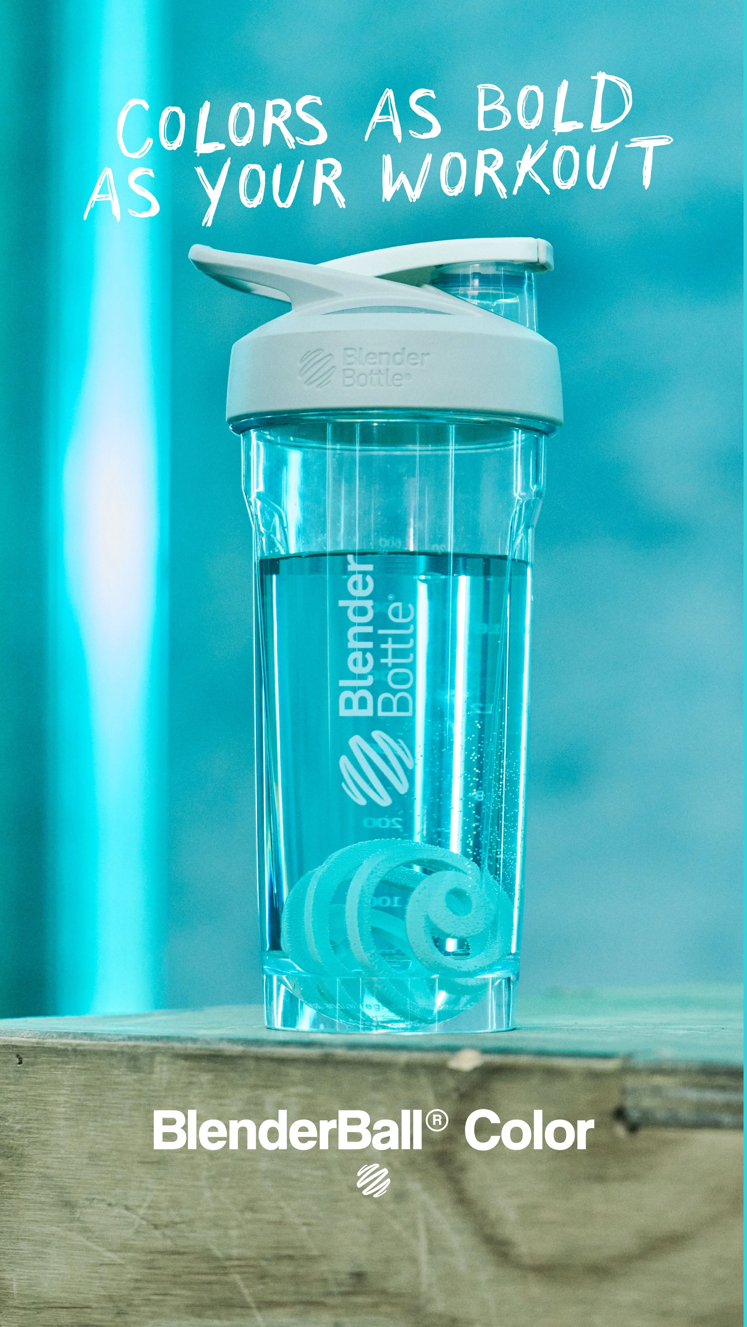
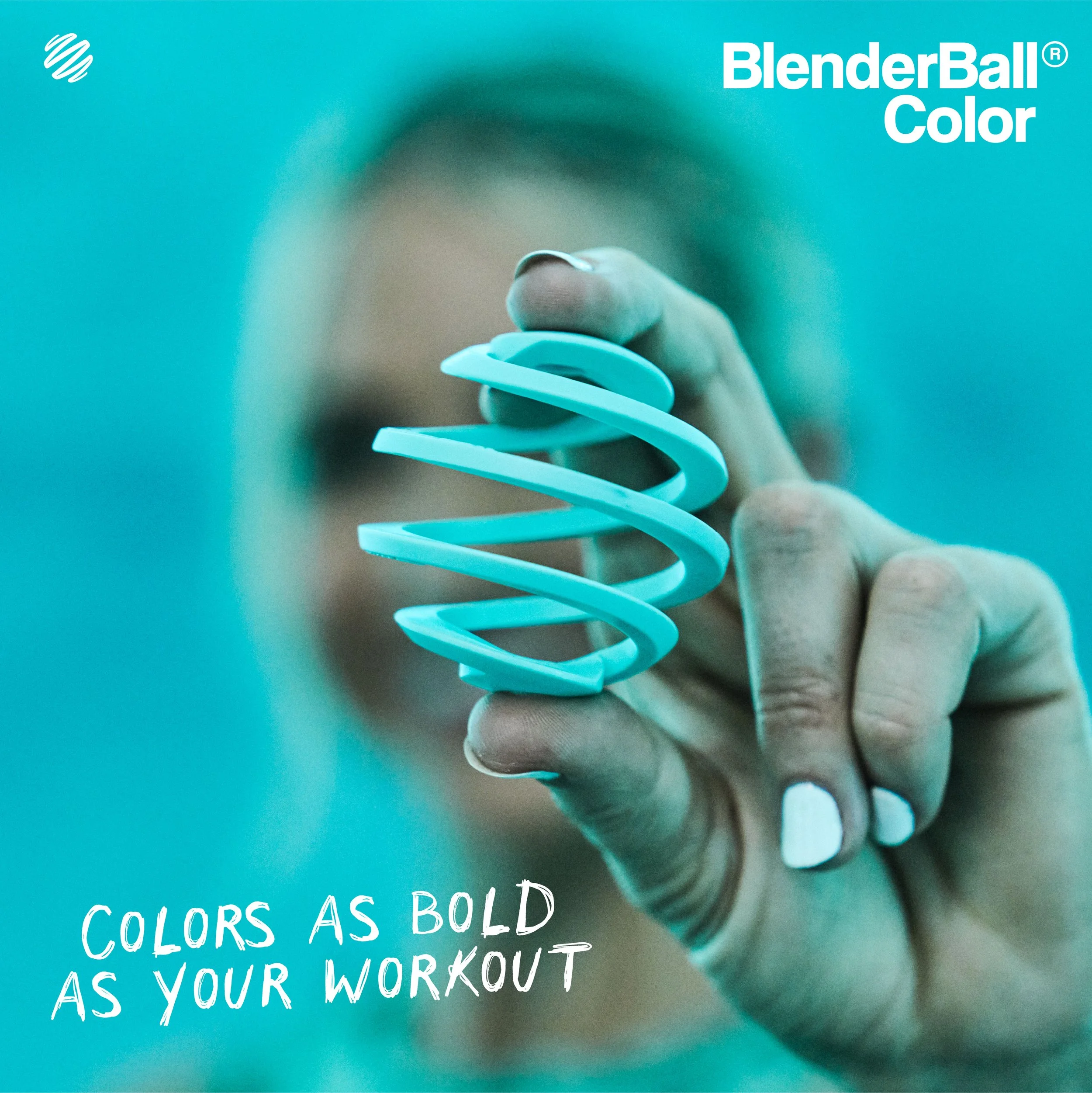
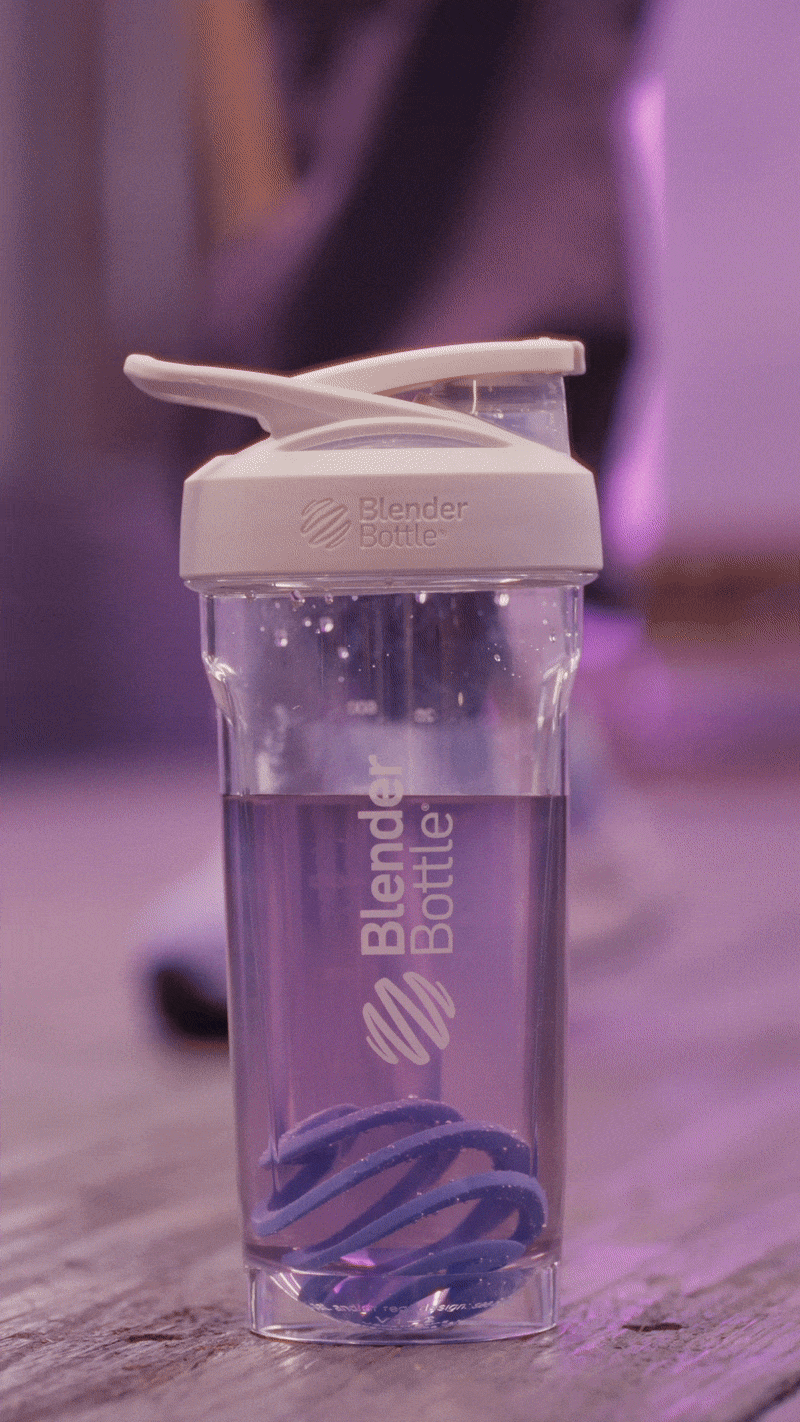
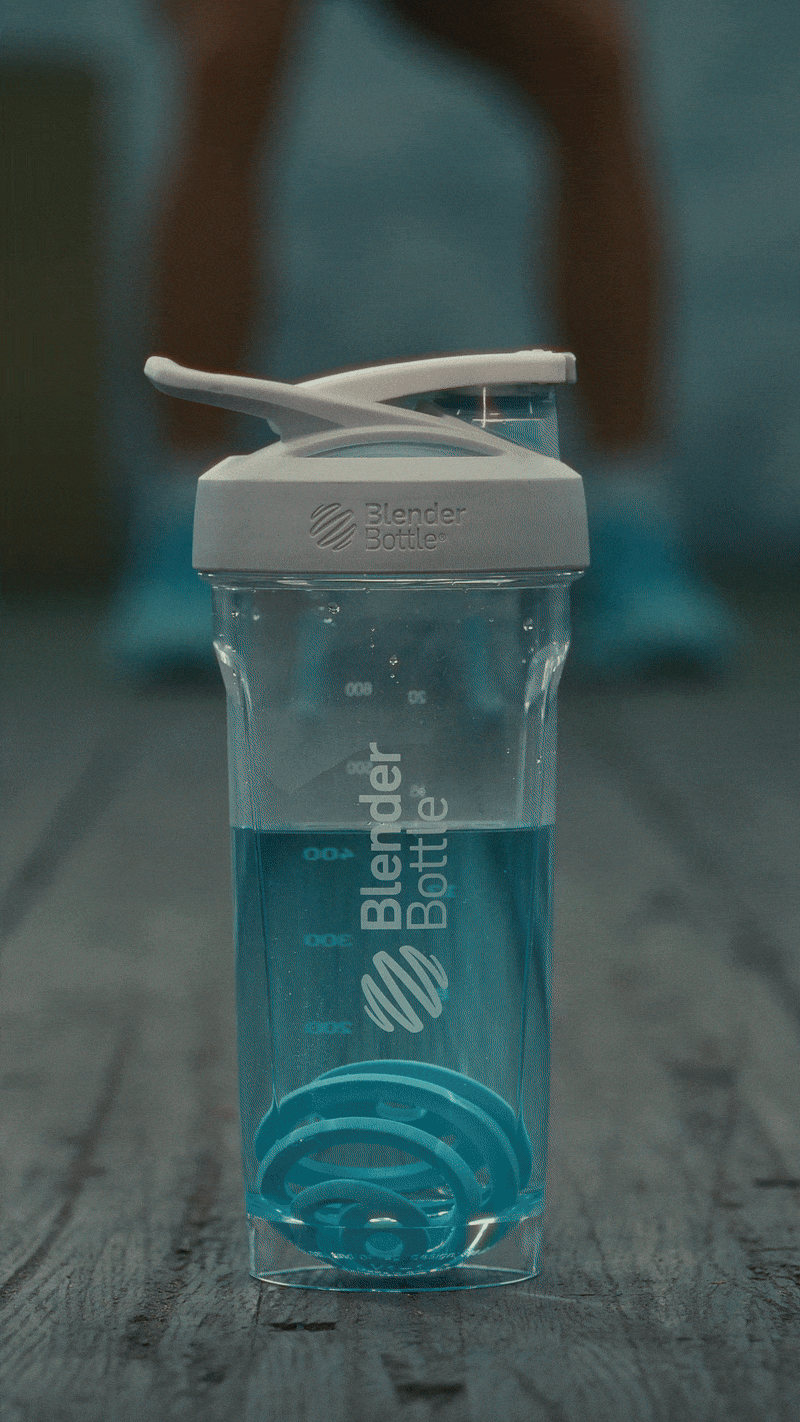
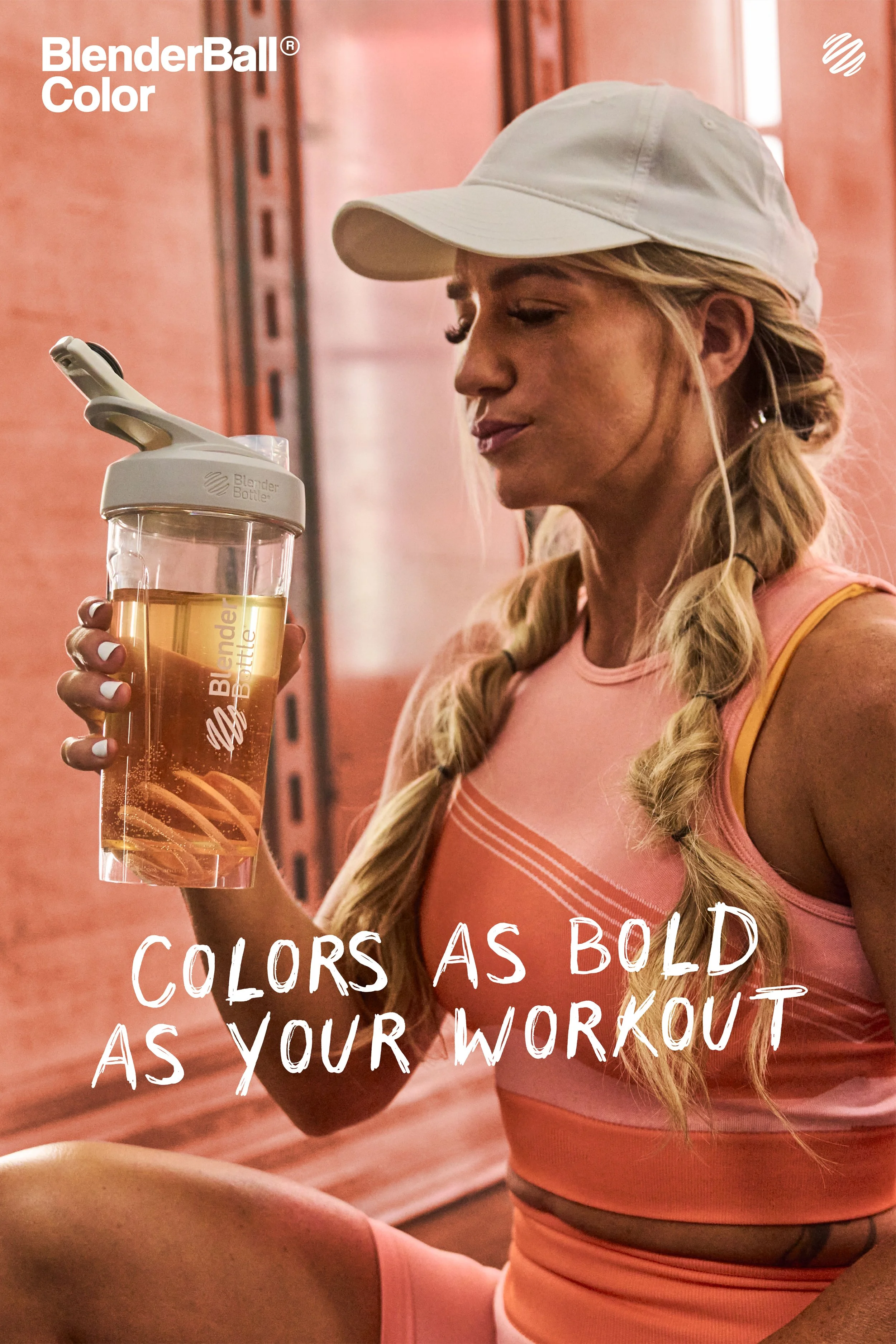
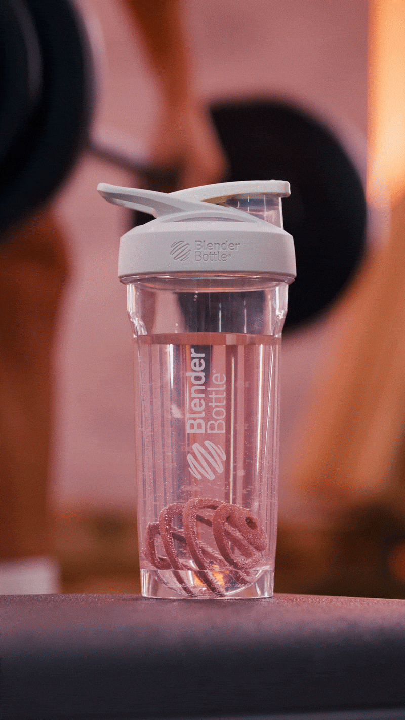
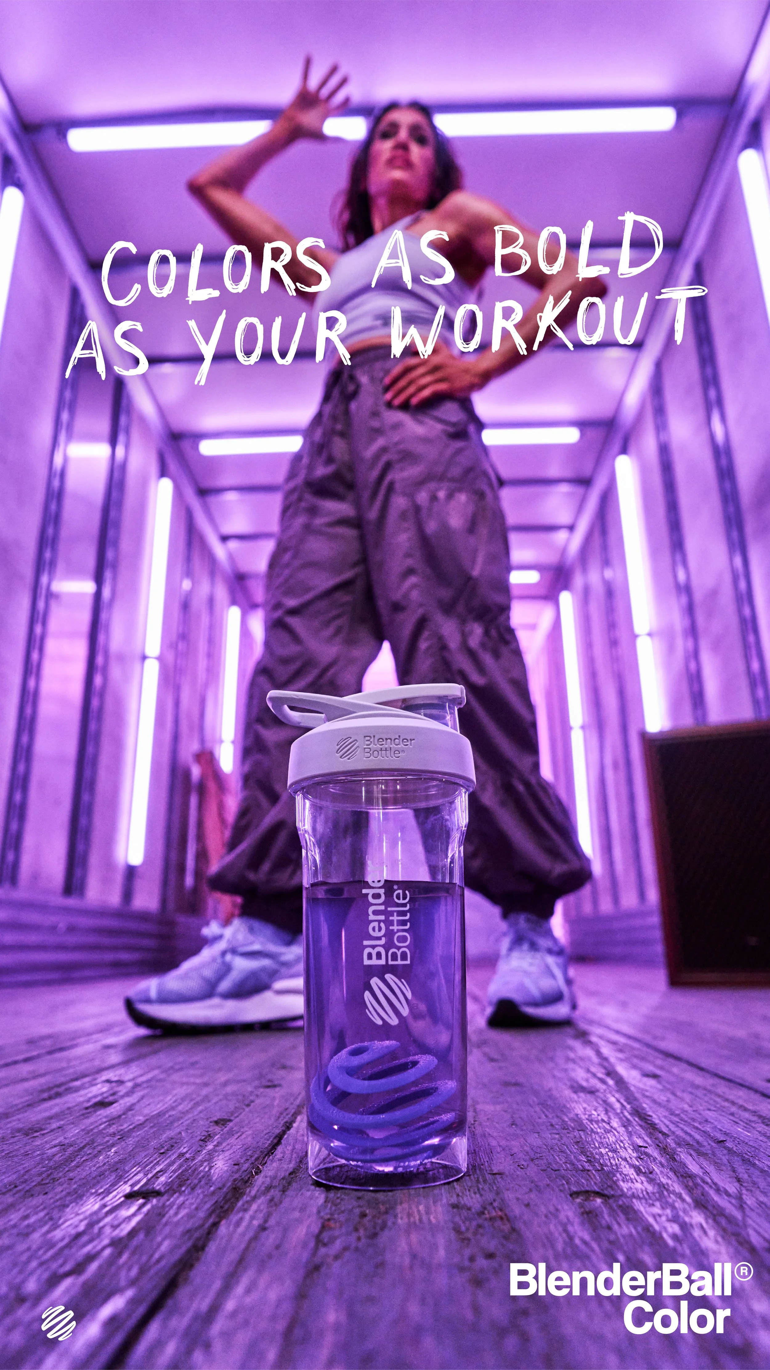
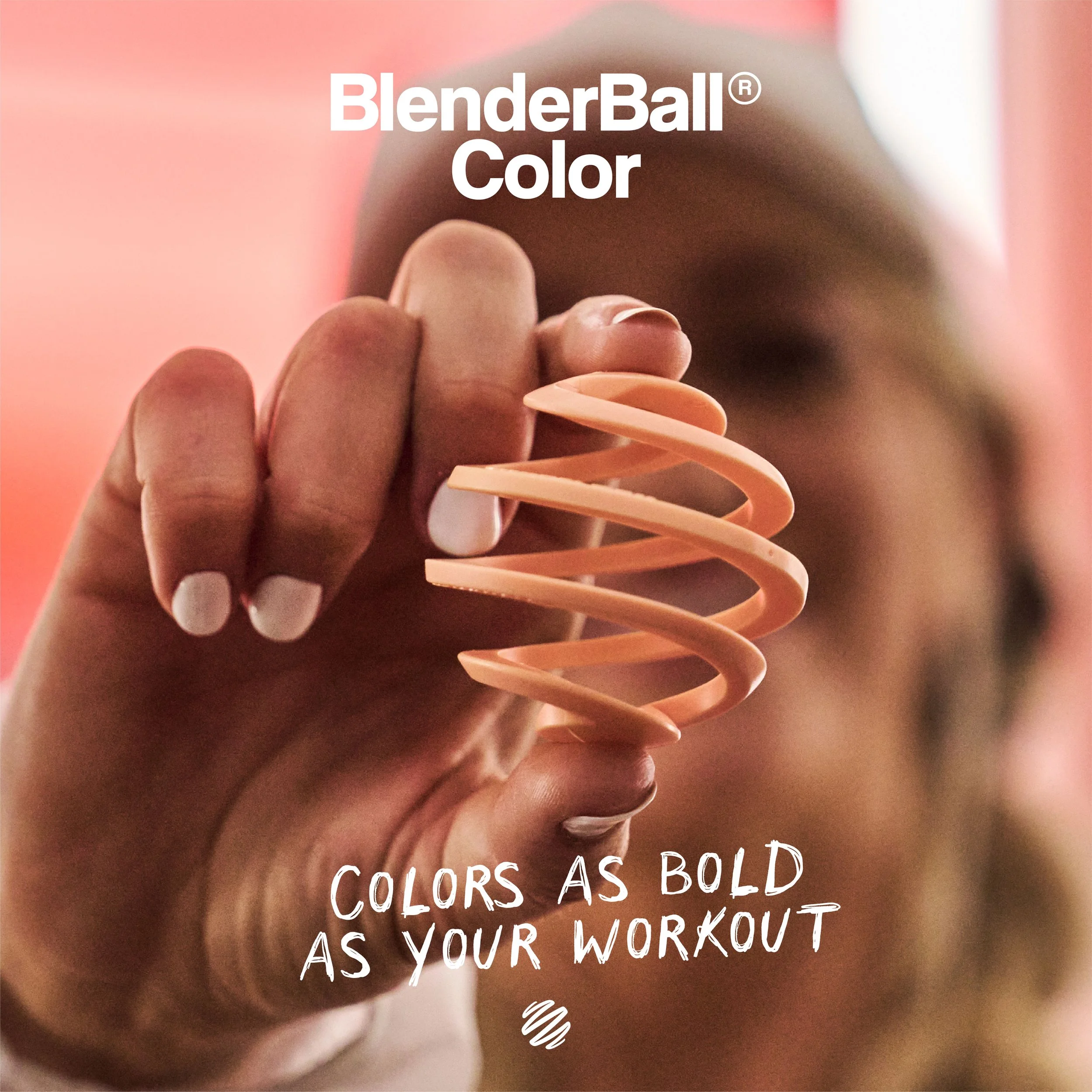
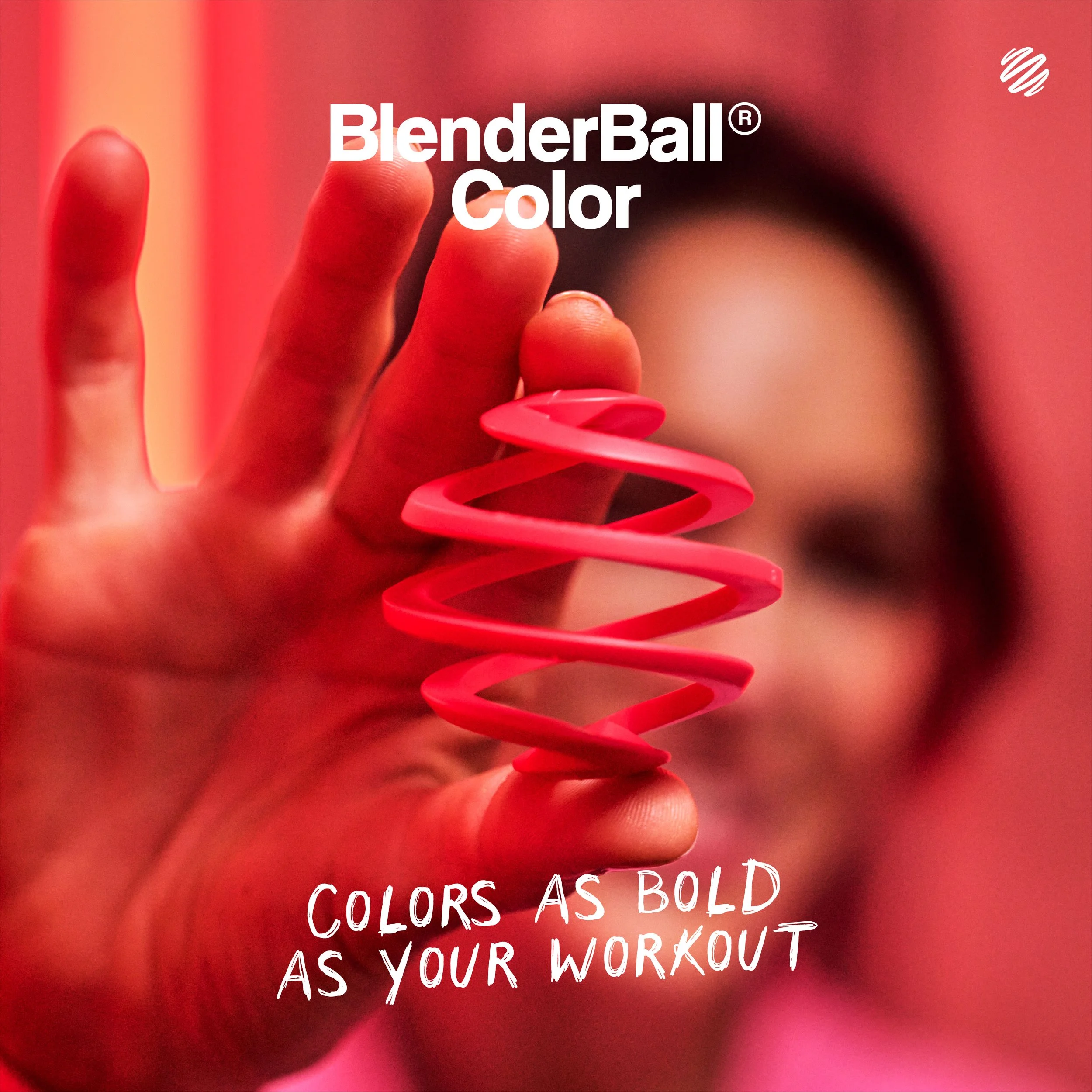
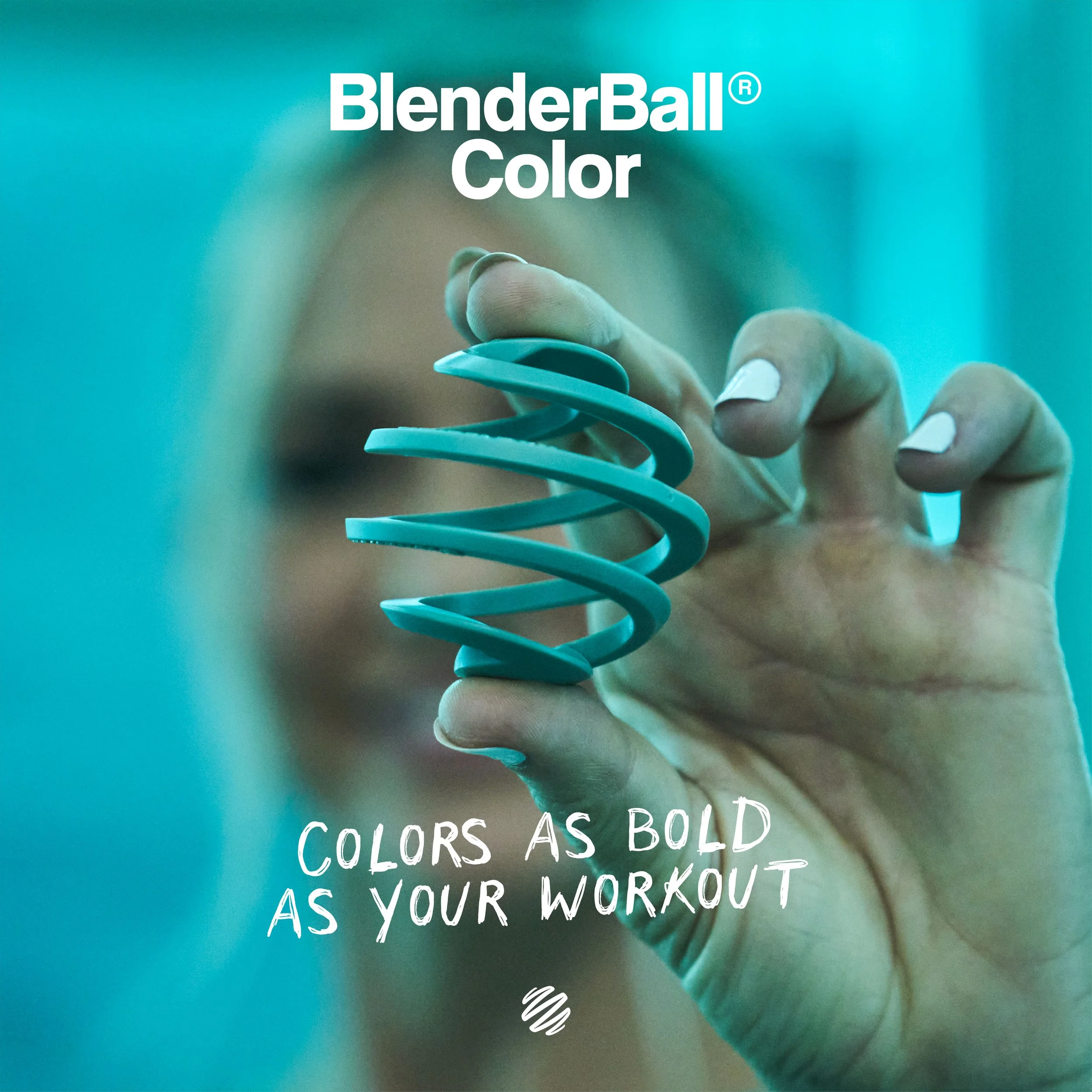
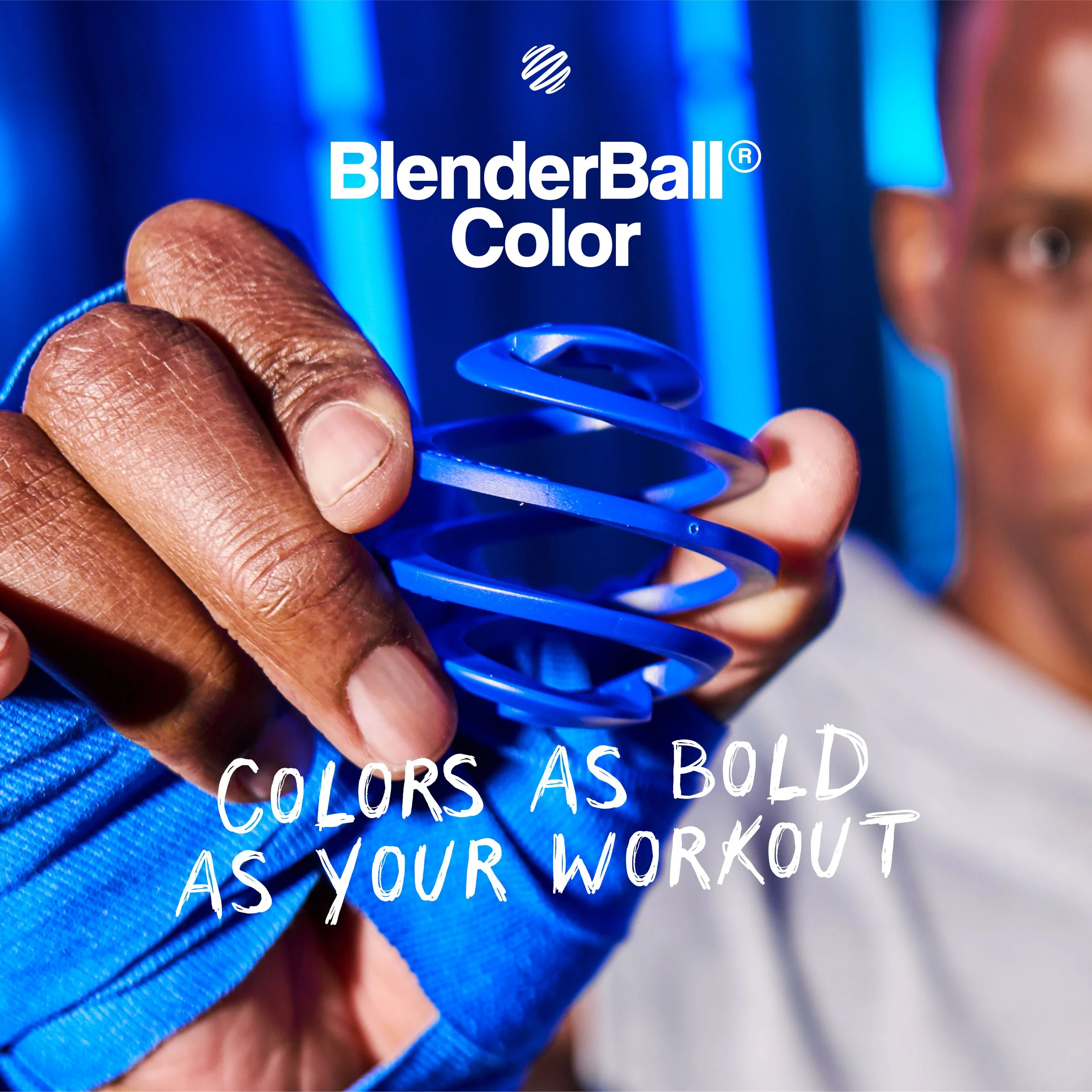
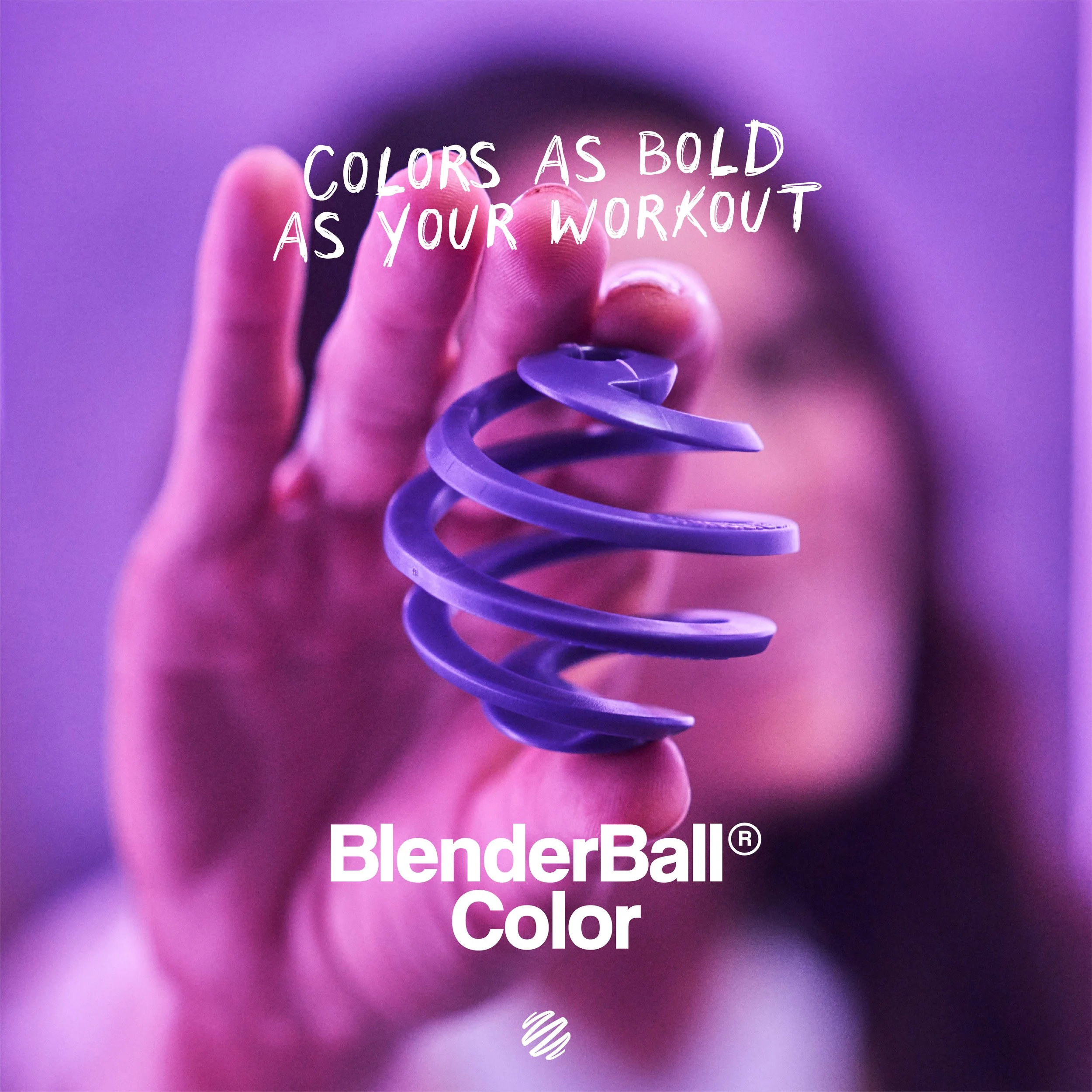
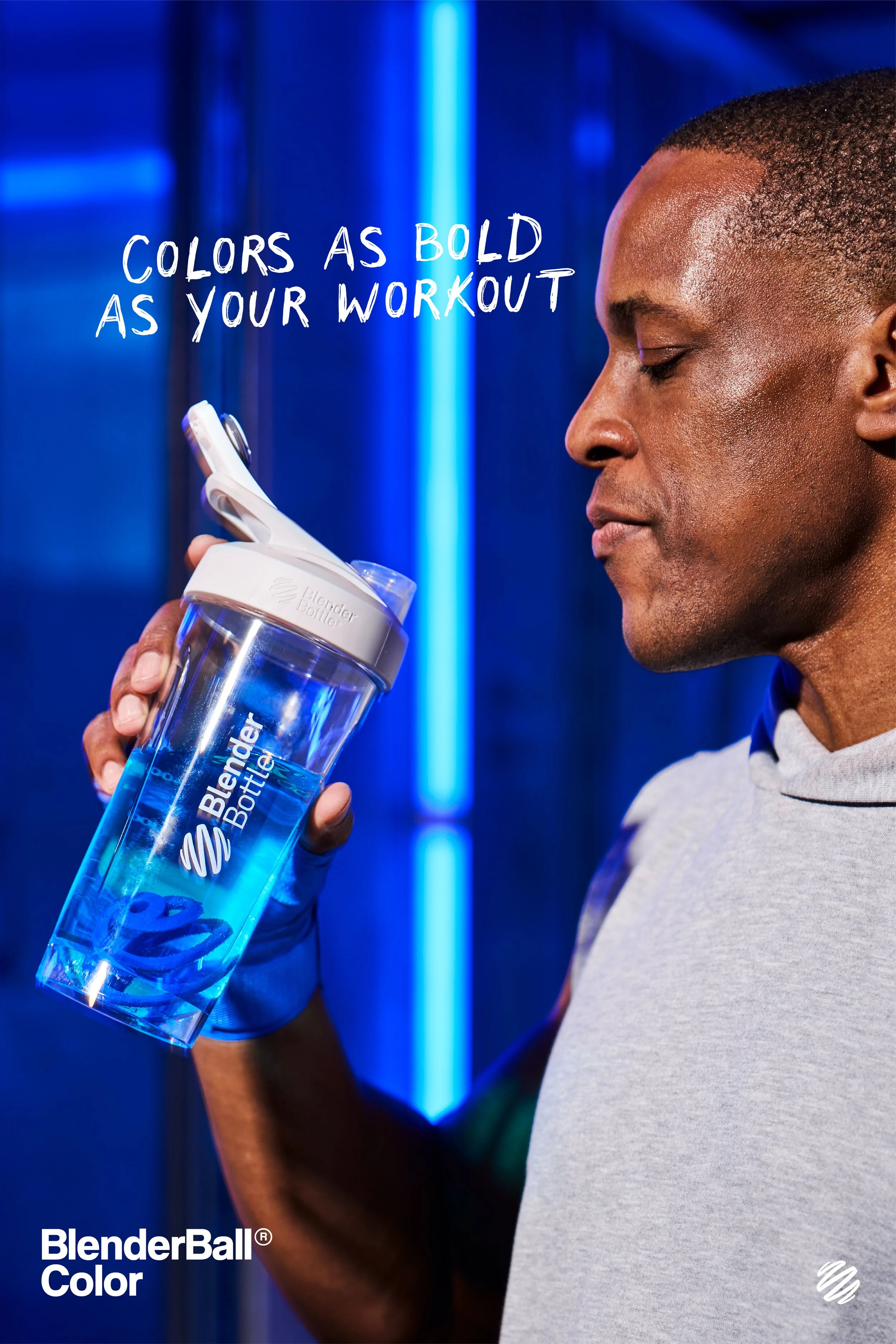
As the first redesign of the iconic BlenderBall wire whisk, BlenderBall Color, a new plastic whisk brings color and personality to performance. Released in nine expressive shades, the BlenderBall Color retains the same mixing technology athletes and everyday users trust—now with a splash of individuality. This shoot aimed to visually bridge the gap between function and fun, showing that users no longer have to choose between performance and personality in their fitness gear.
I was key in bringing this launch to life, overseeing art direction from early concept through final rollout. This included developing internal presentation materials, hiring talent, and directing the photoshoot and launch video. I also designed the final marketing assets to ensure a consistent and impactful debut across all platforms.


Research & Strategy
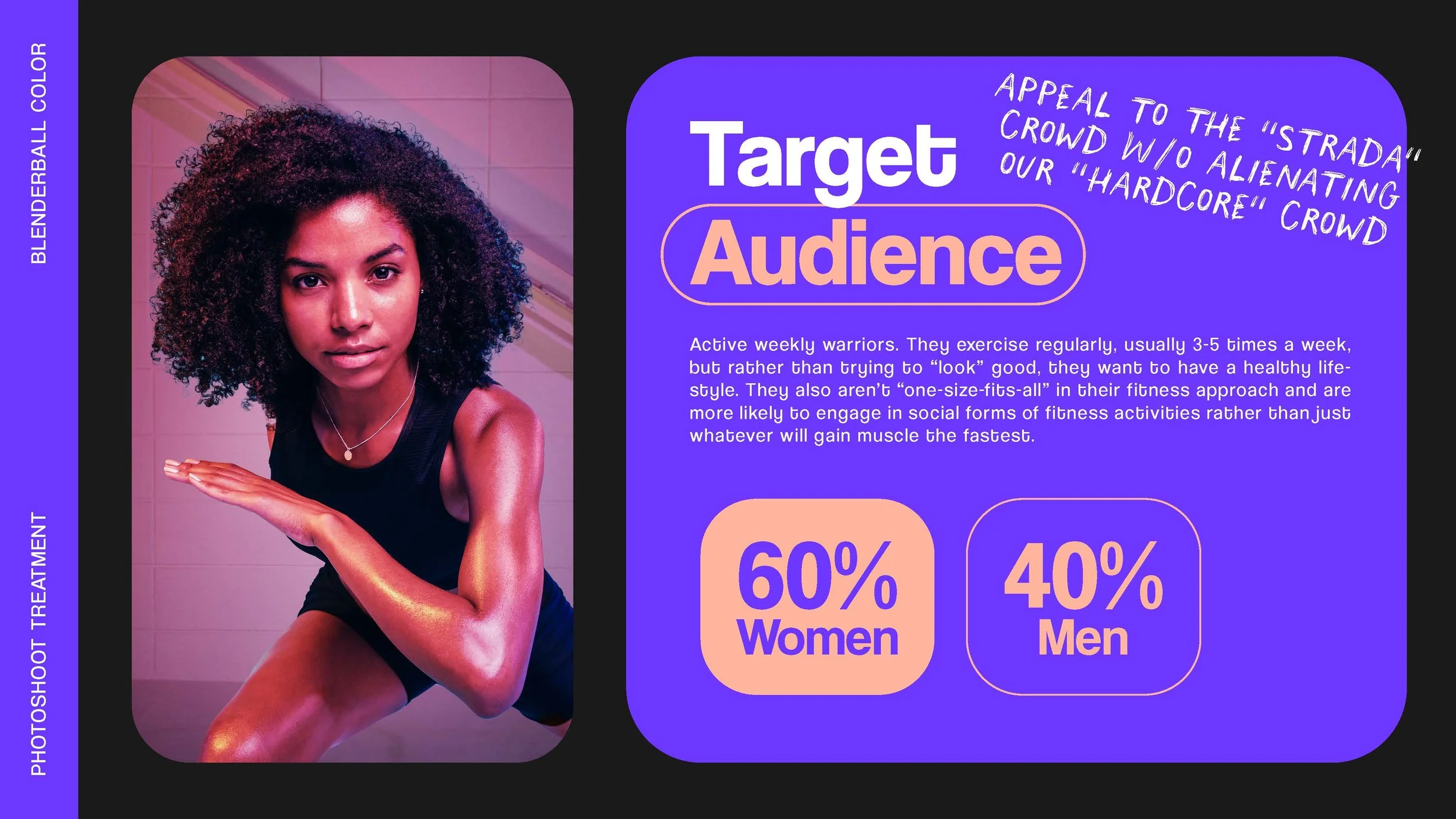
BlenderBall Color was designed with the Active Weekly Warrior in mind—individuals who work out consistently (3–5 times per week) and prioritize long-term wellness over aesthetics. This audience values a balanced, sustainable fitness lifestyle that’s often social, enjoyable, and varied rather than hyper-focused on gains alone.
While many are runners or group class regulars, they’re also adjacent to the more hardcore fitness community of CrossFit athletes, competitive lifters, and traditional gym-goers. Our goal was to create a campaign that welcomed both sides of this spectrum: celebrating functionality and discipline while infusing it with personality, fun, and approachability.
Concept & Mood
The creative direction focused on making BlenderBall Color feel like a splash of fun in a fitness routine—something that elevates performance without taking itself too seriously. Inspired by the tone of a motivating fitness coach, the mood strikes a perfect balance between expert and enthusiast.


Rather than talking at the audience, we wanted the visuals and messaging to feel like an invitation—taking them with us on the journey. Bright color, bold energy, and a sense of genuine joy in movement shaped the vibe. The result is a campaign that makes fitness feel motivating, inclusive, and expressive—less about perfection, more about participation.
Photoshoot & Art Direction
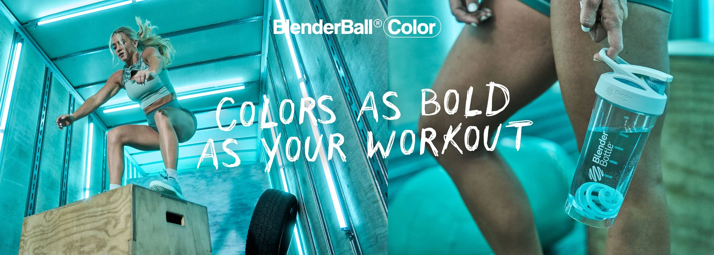
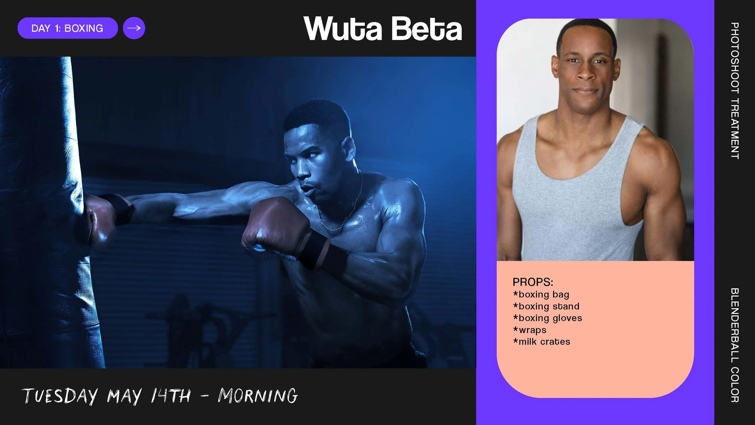
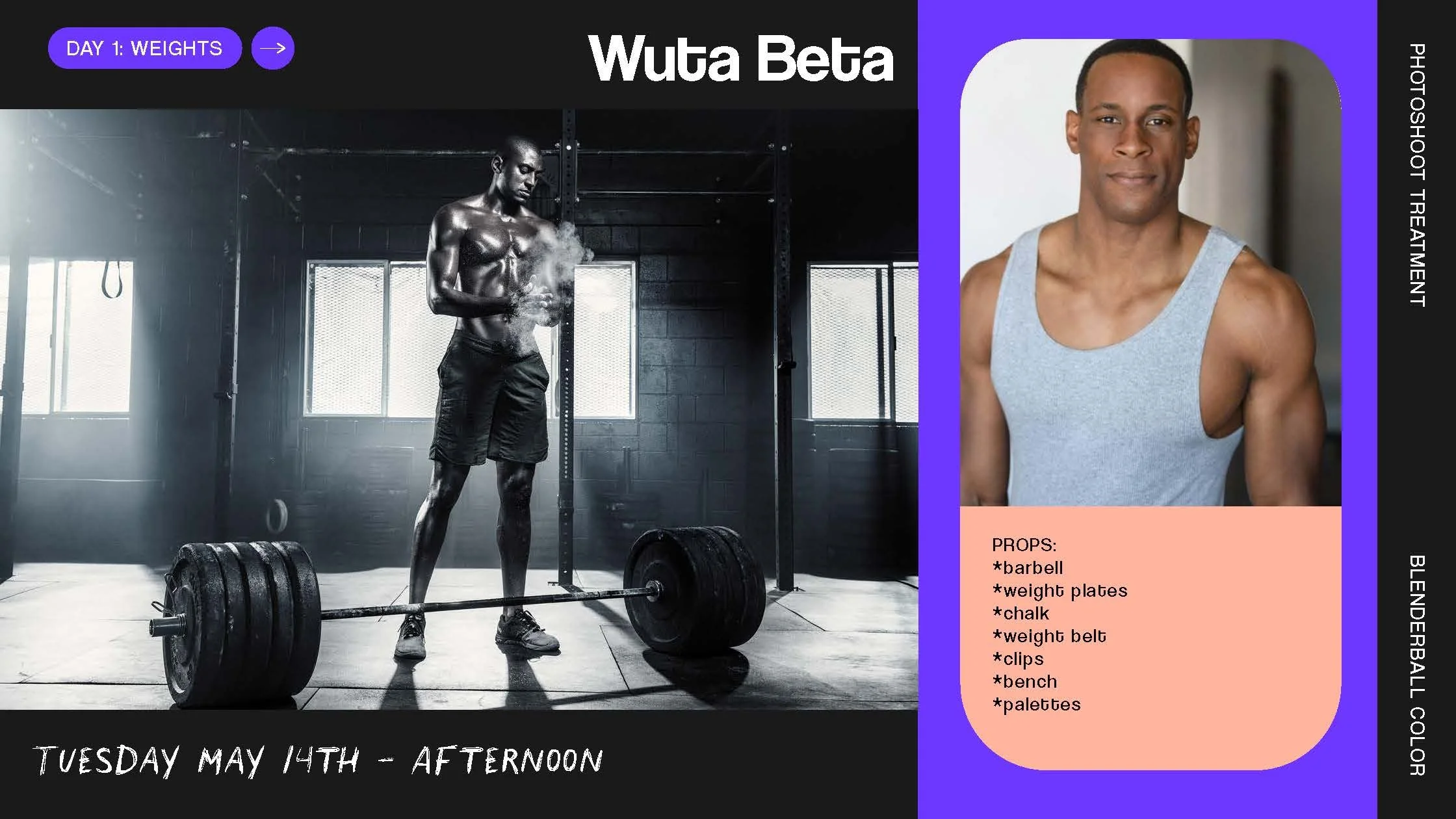
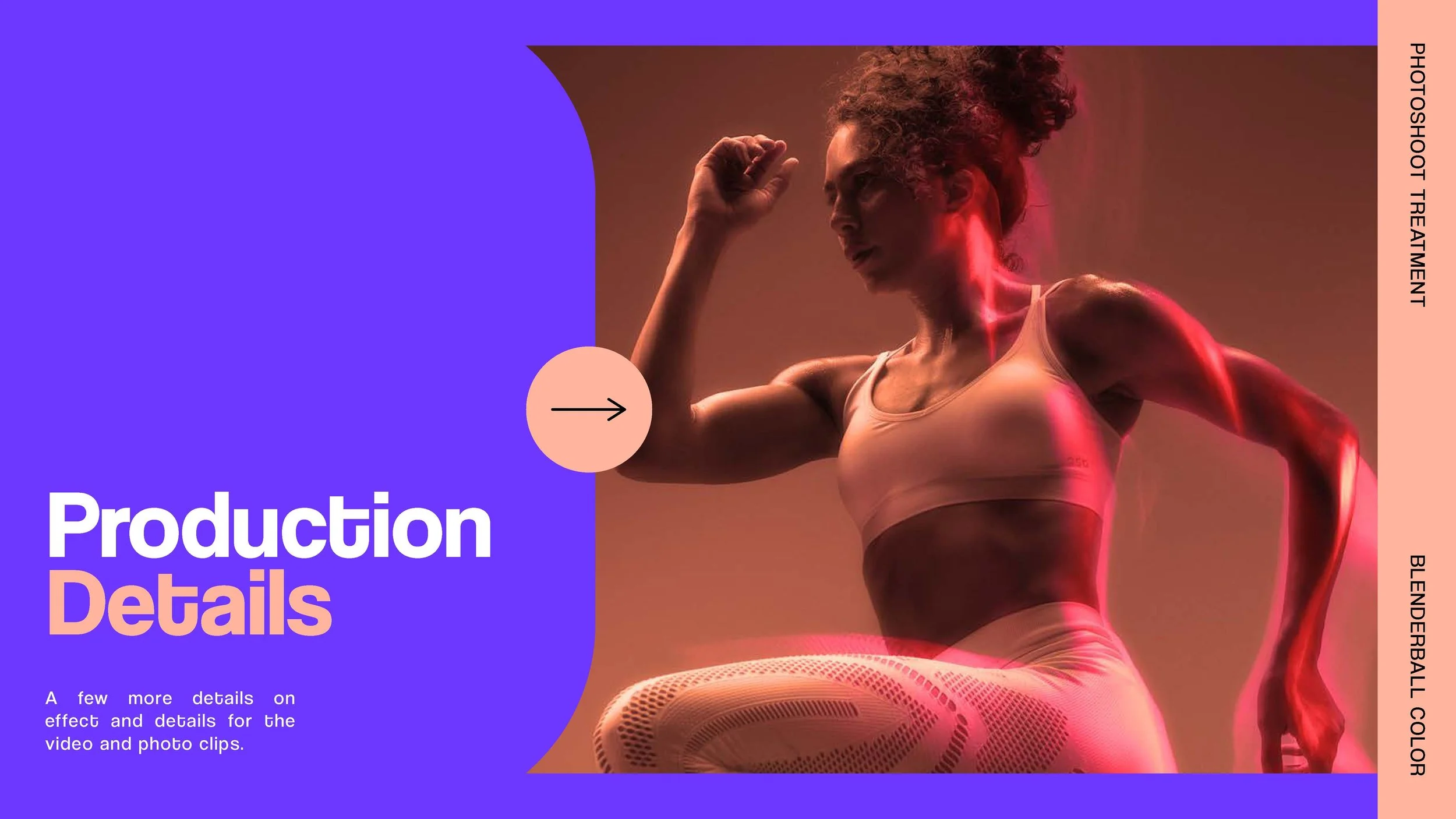
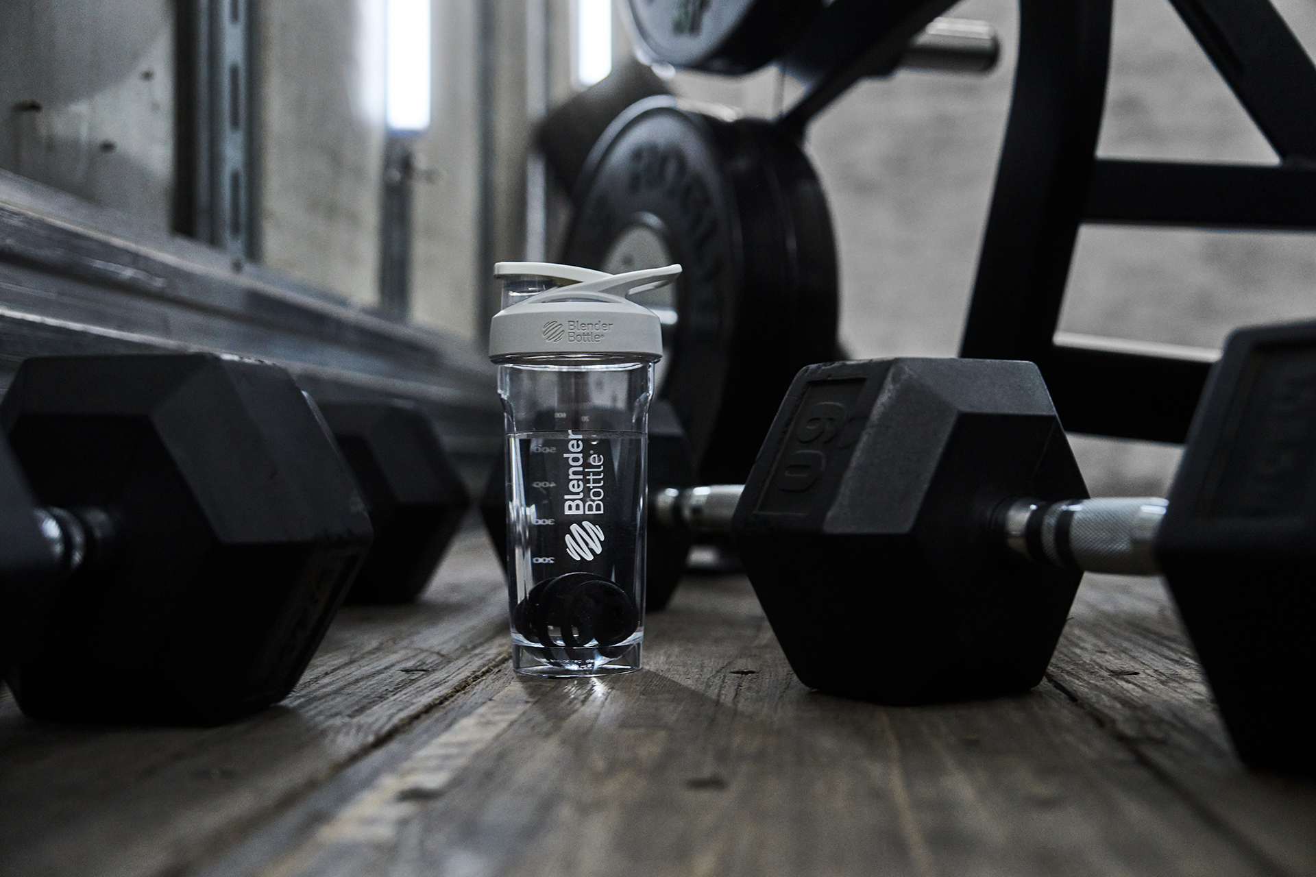
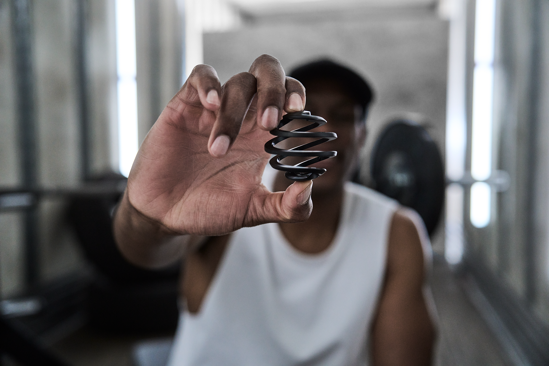
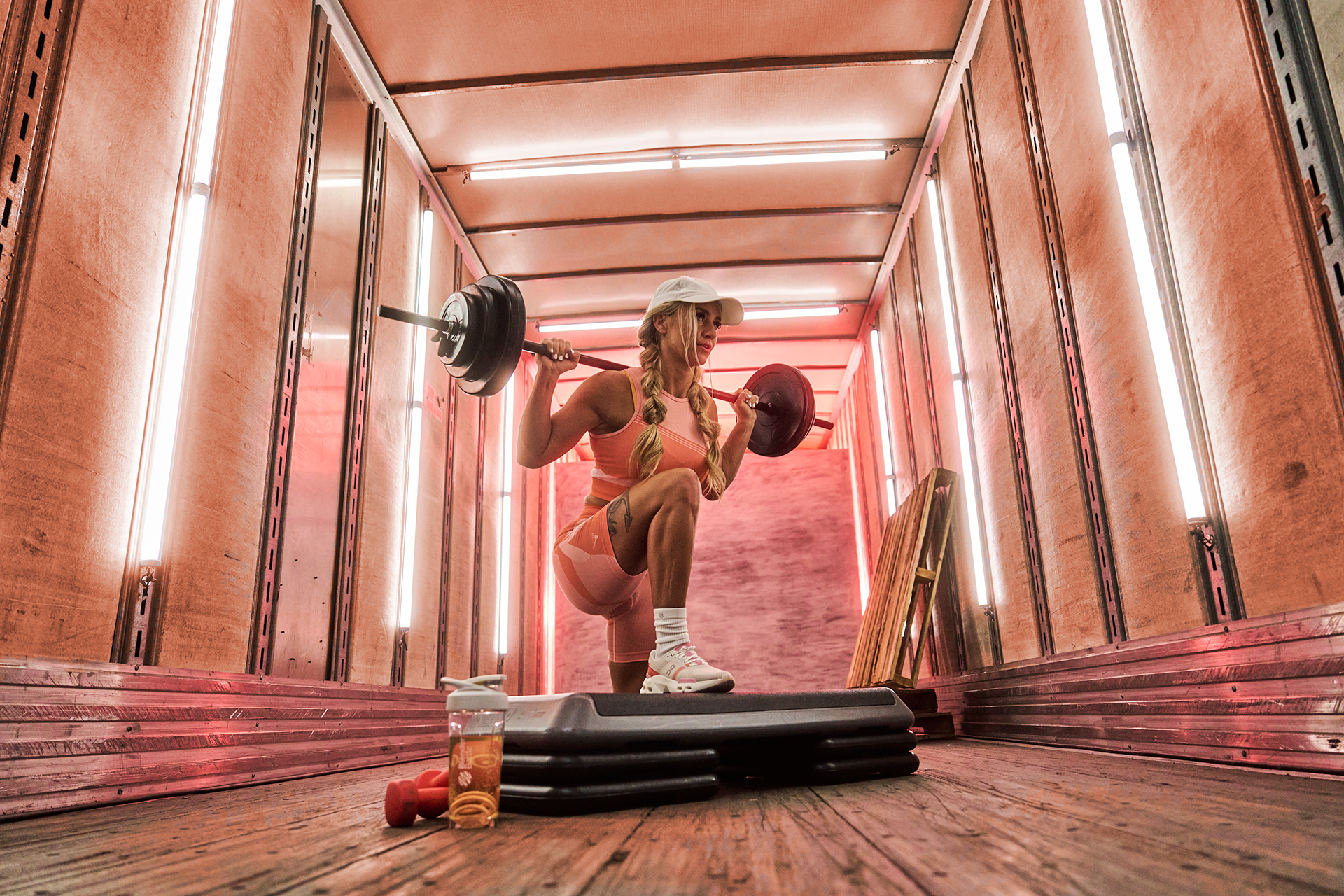
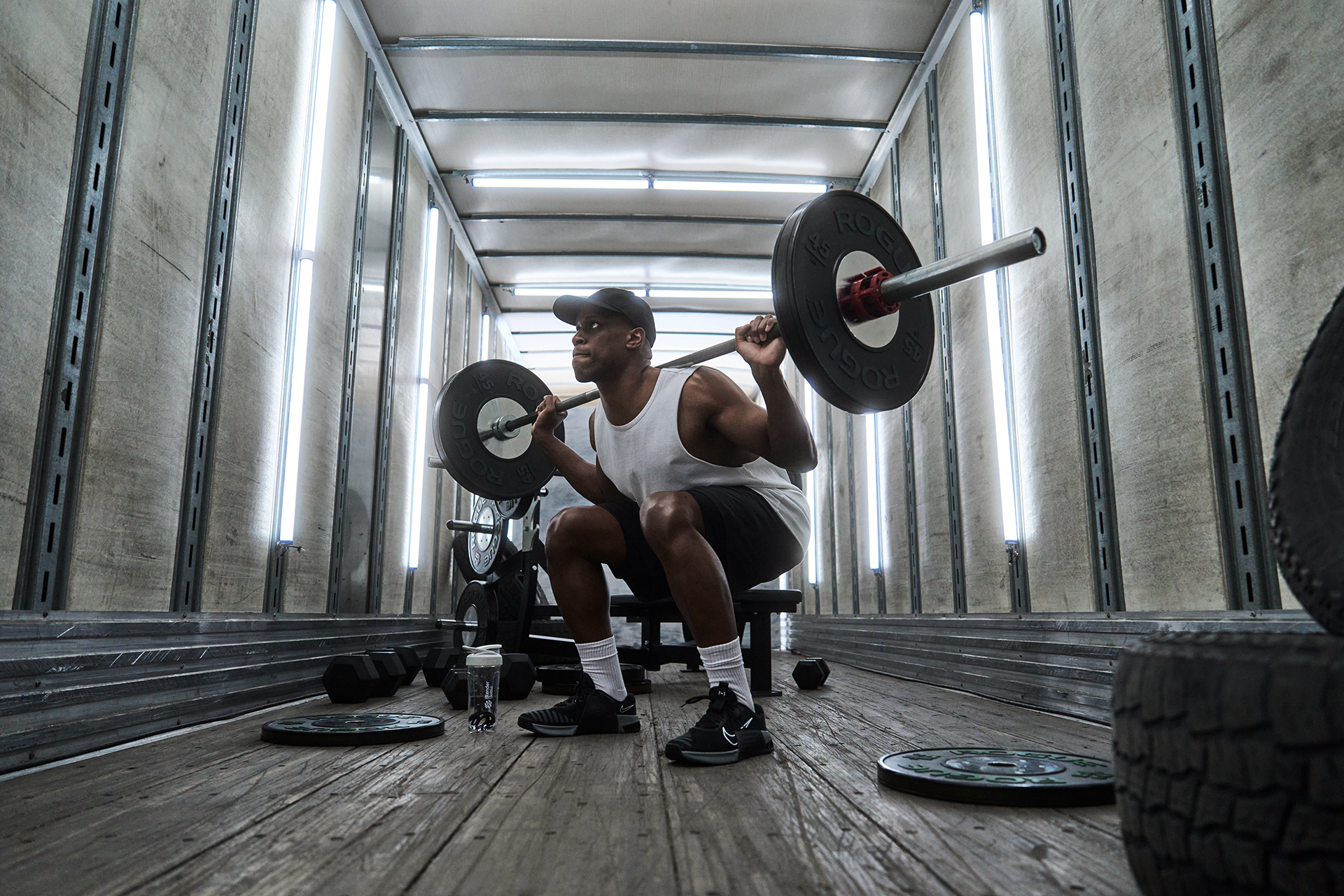
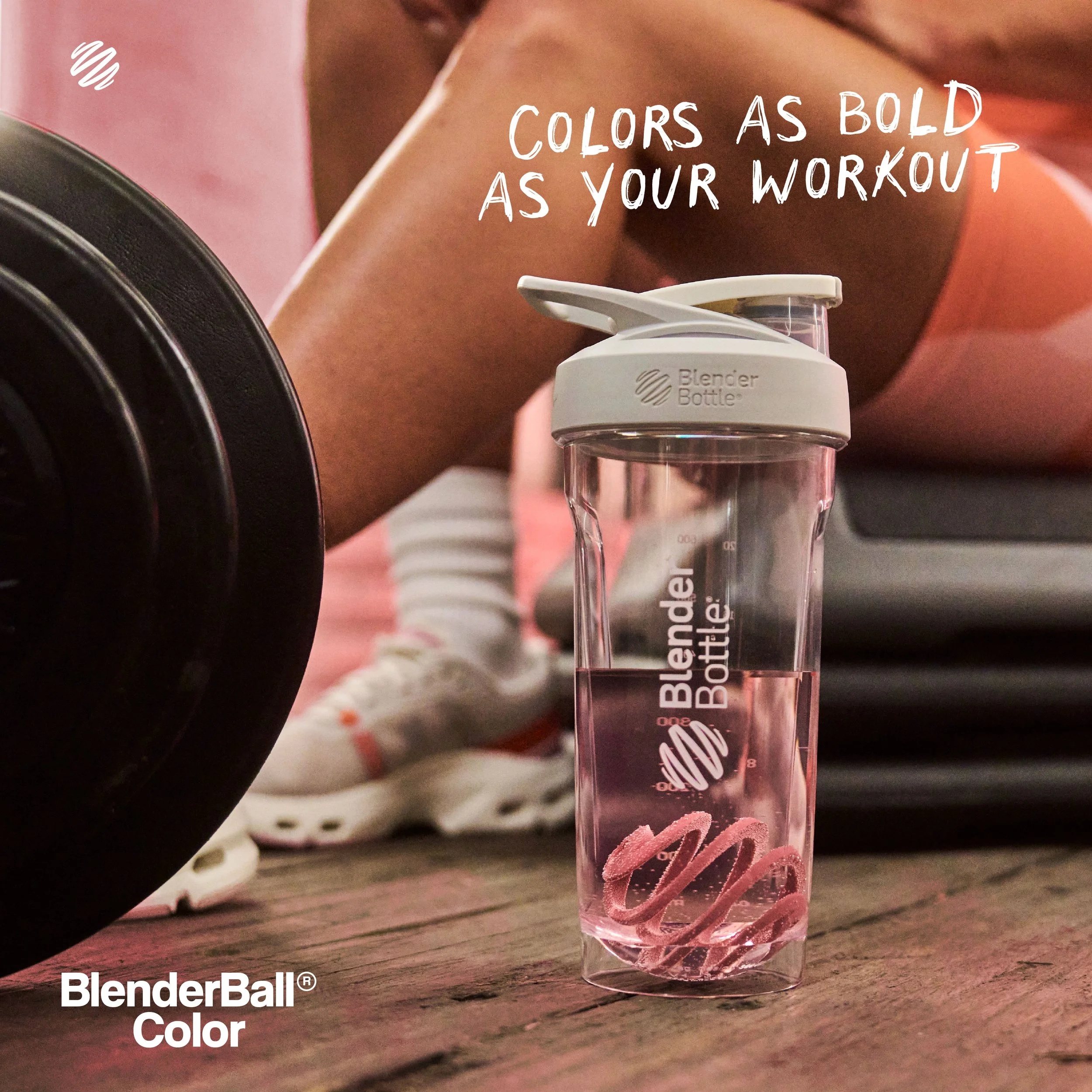
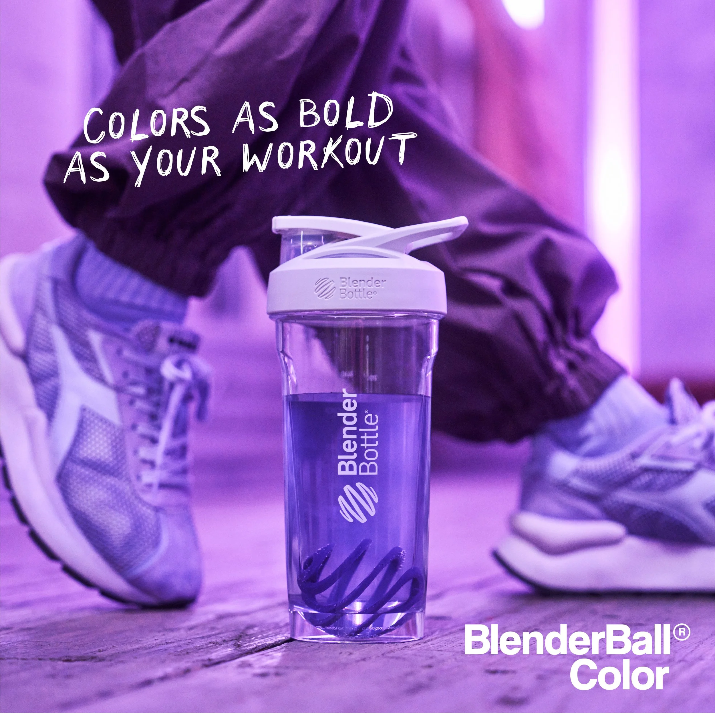
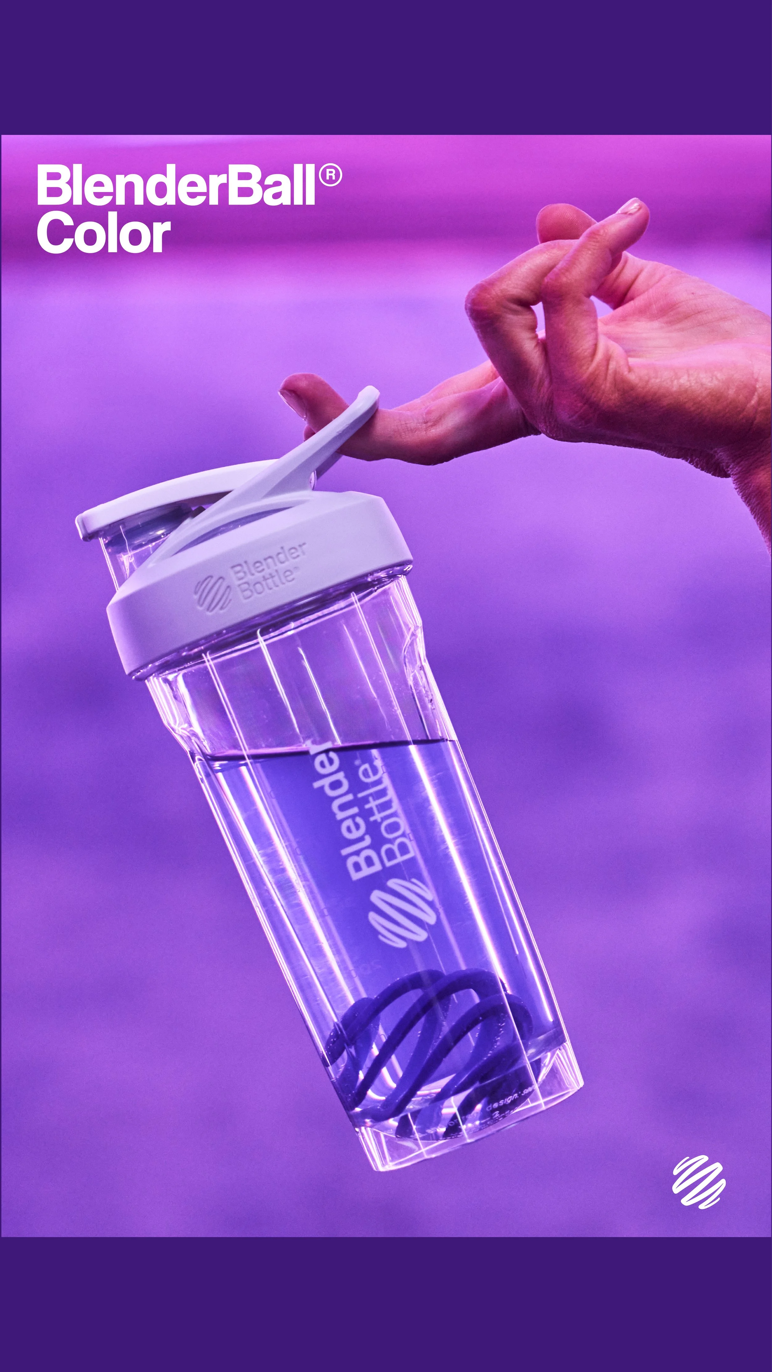
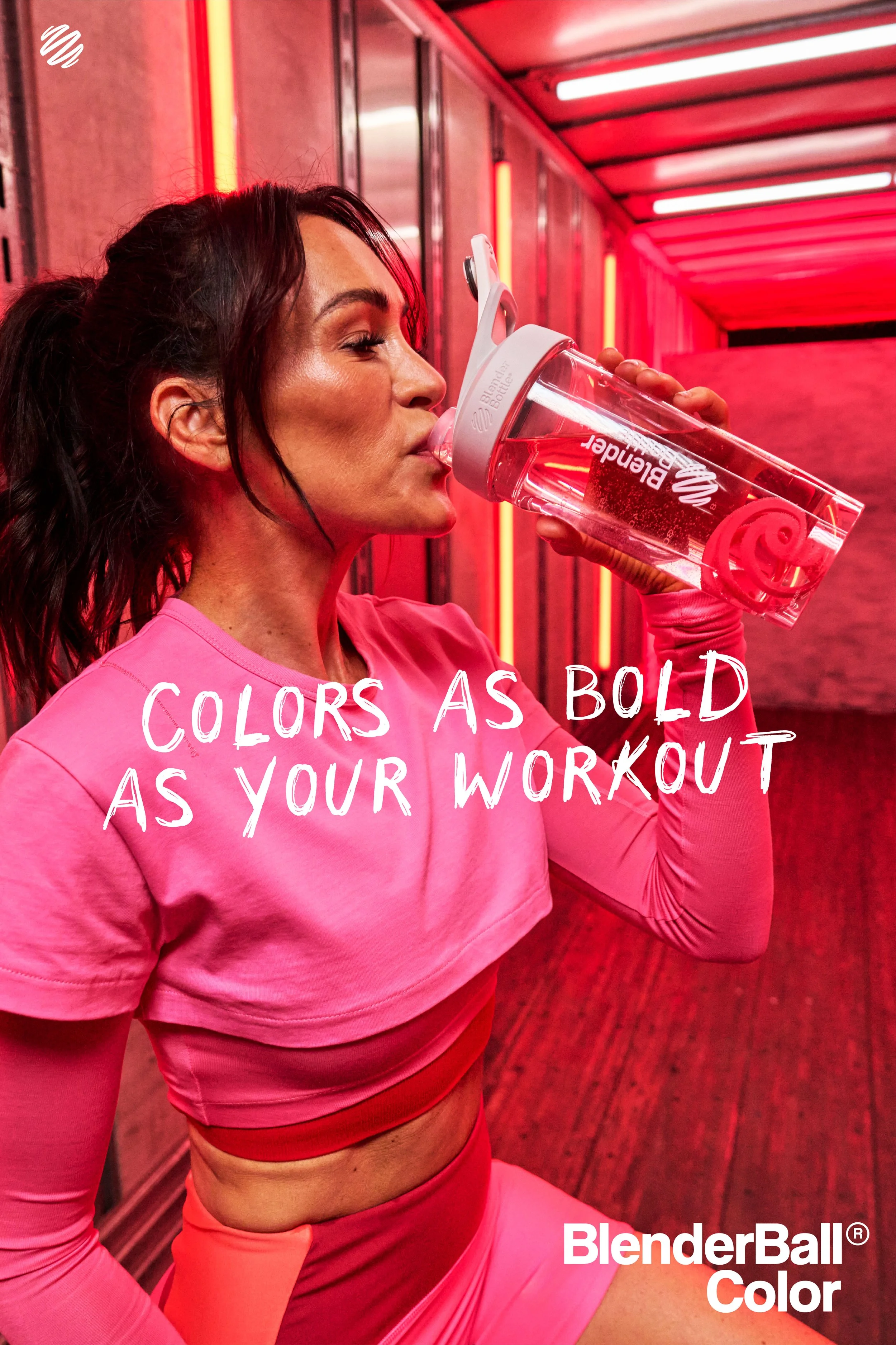
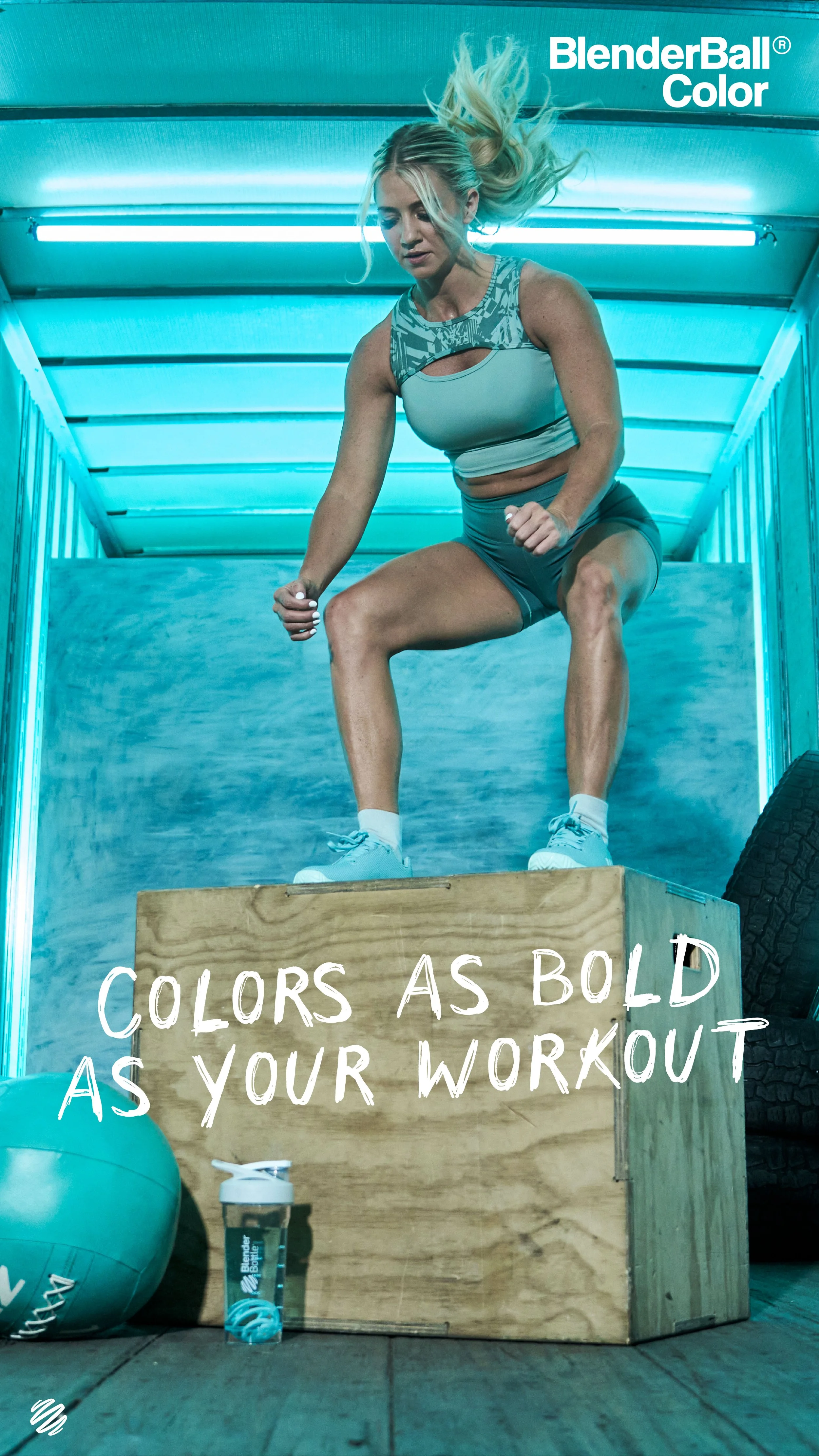
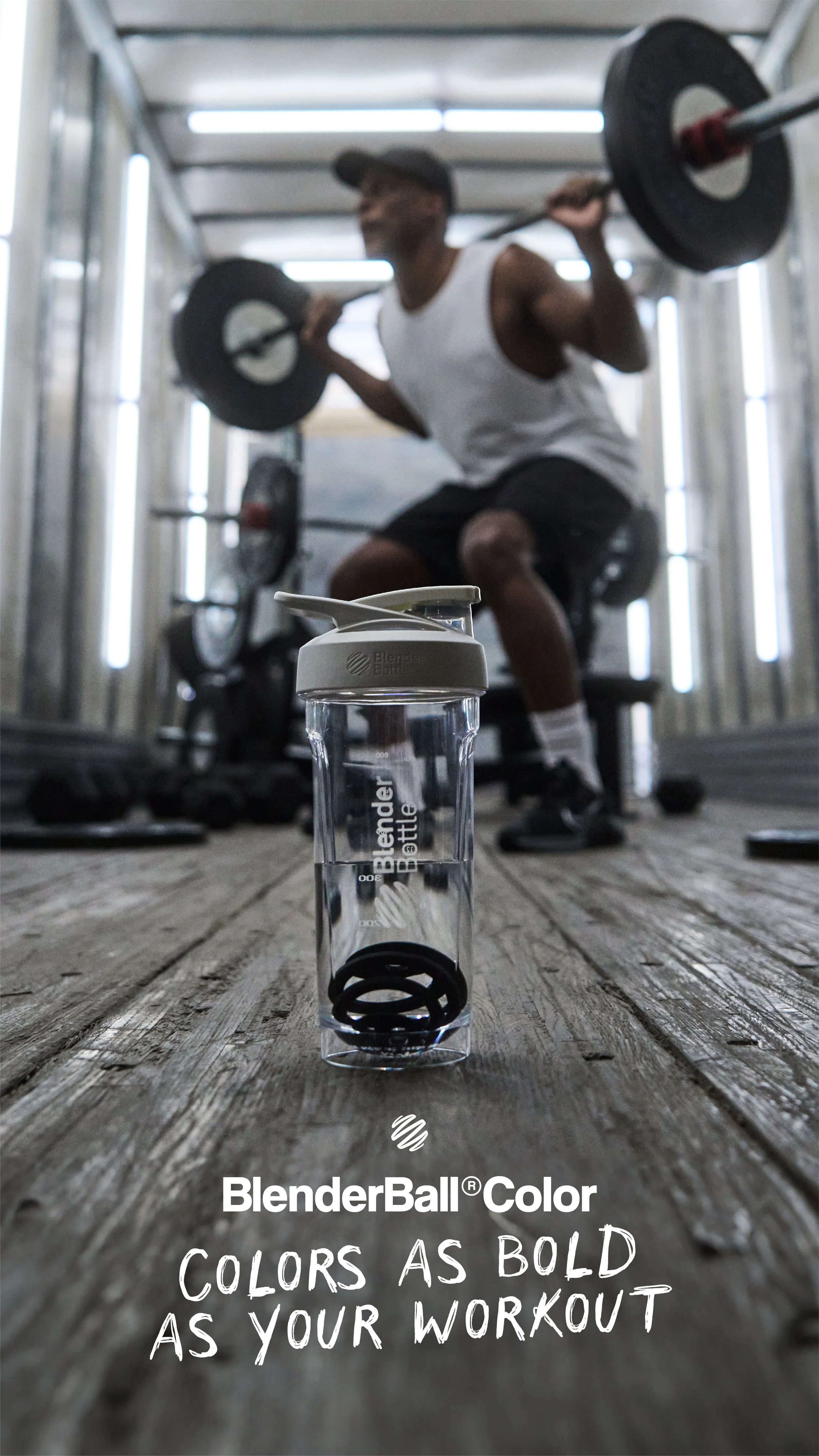
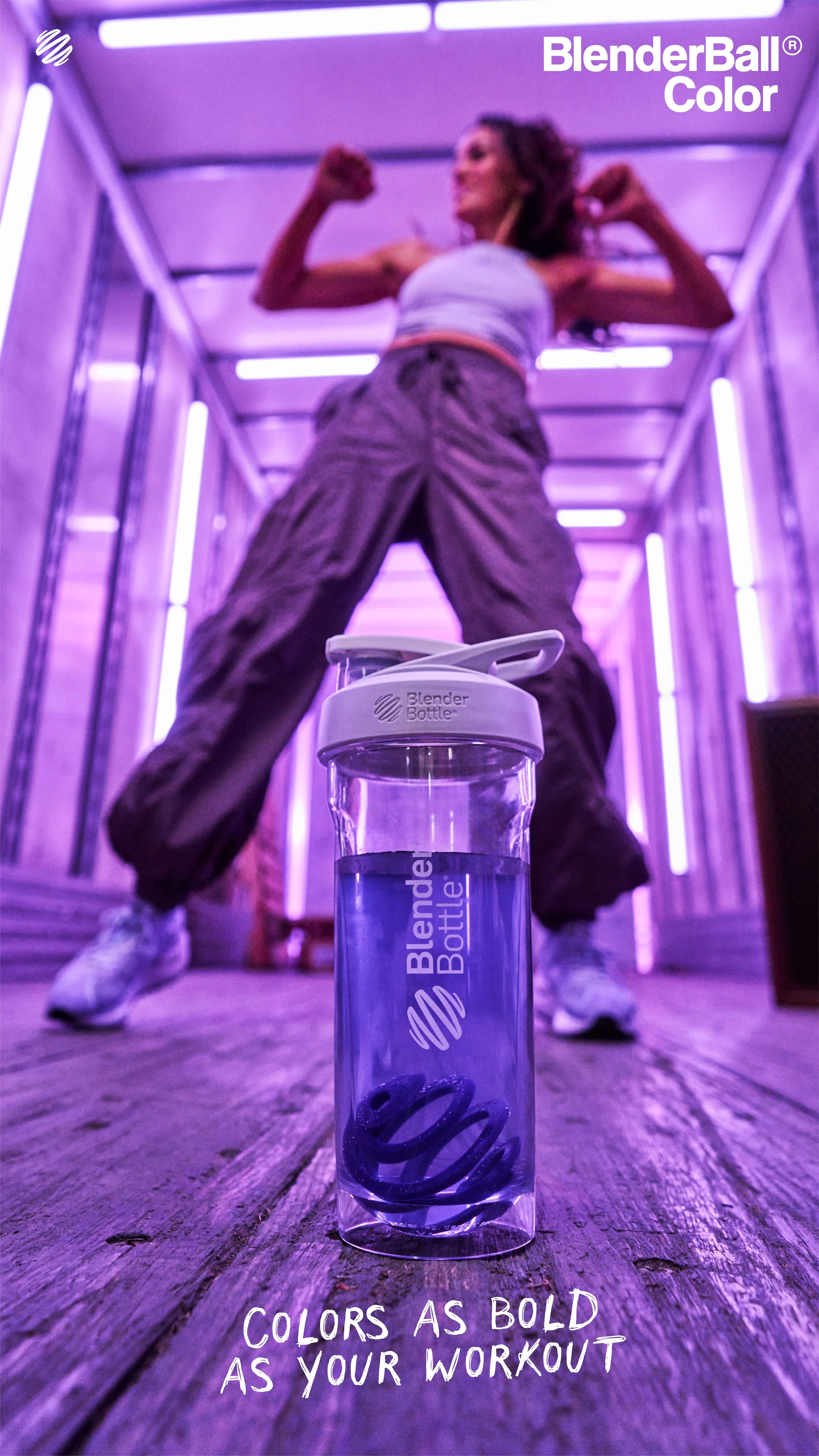
The shoot was inspired by one of BlenderBottle’s early product launch videos for the Pro32 shaker cup, which was filmed in the back of a semi-truck trailer—a raw, industrial setting that highlighted the brand’s grit and performance edge. A decade later, we reimagined that iconic backdrop with a fresh twist: transforming the trailer into a dynamic lightscape using color washes and directional lighting to create bold gradients, sharp highlights, and dramatic shadows. This allowed us to bring in the new energy of BlenderBall Color—adding vibrance and personality without sacrificing the toughness of the original concept.
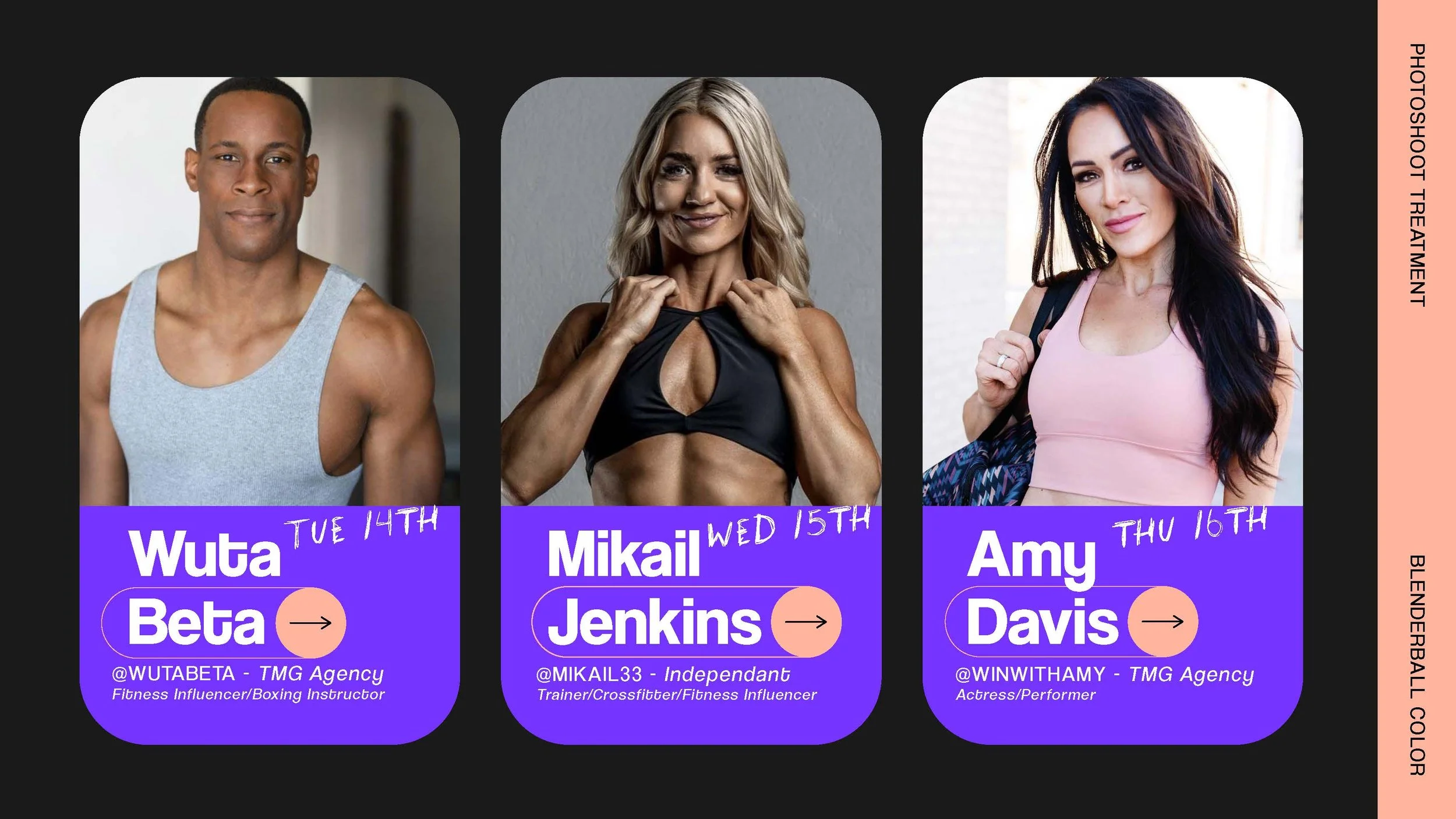
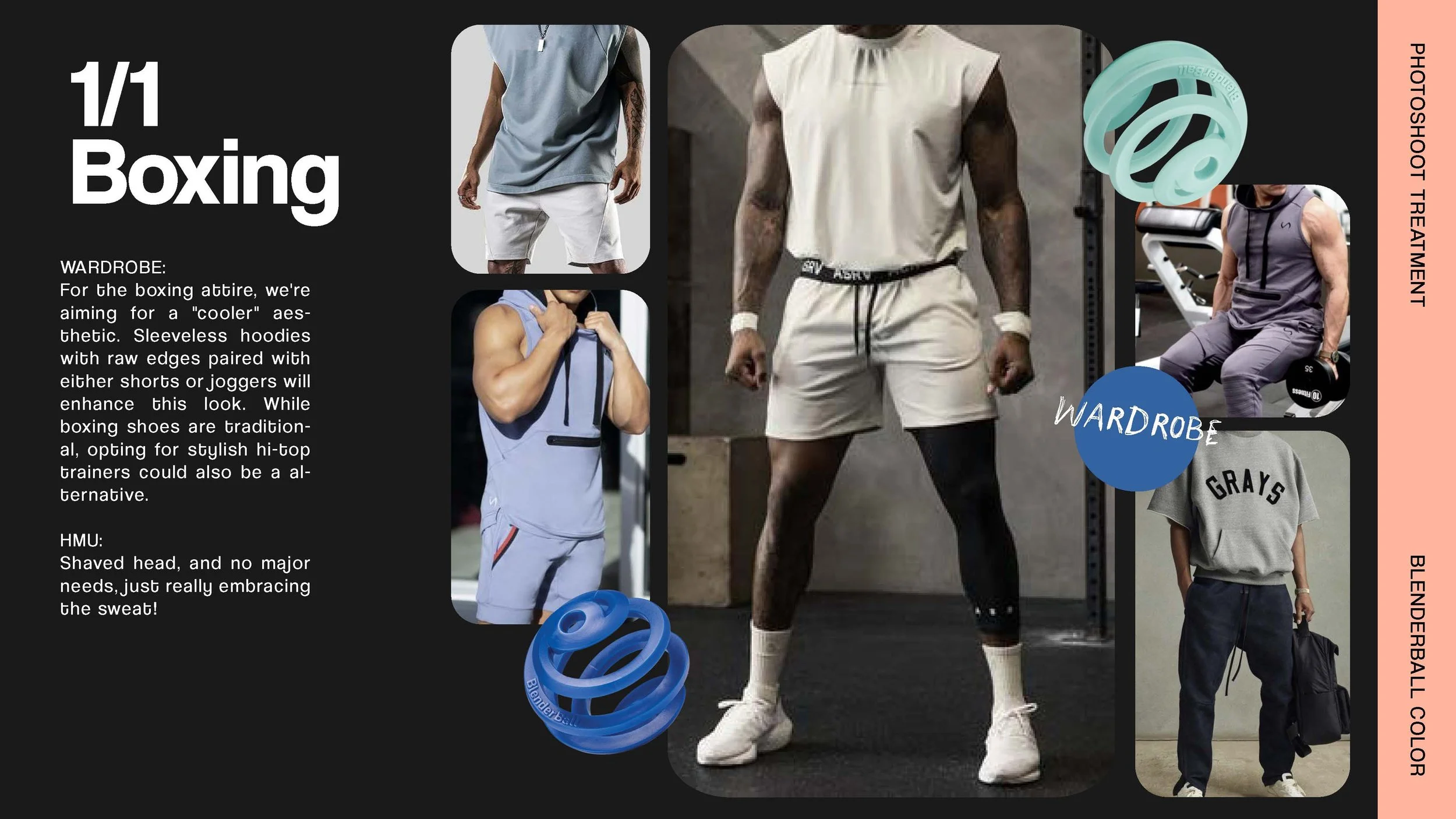
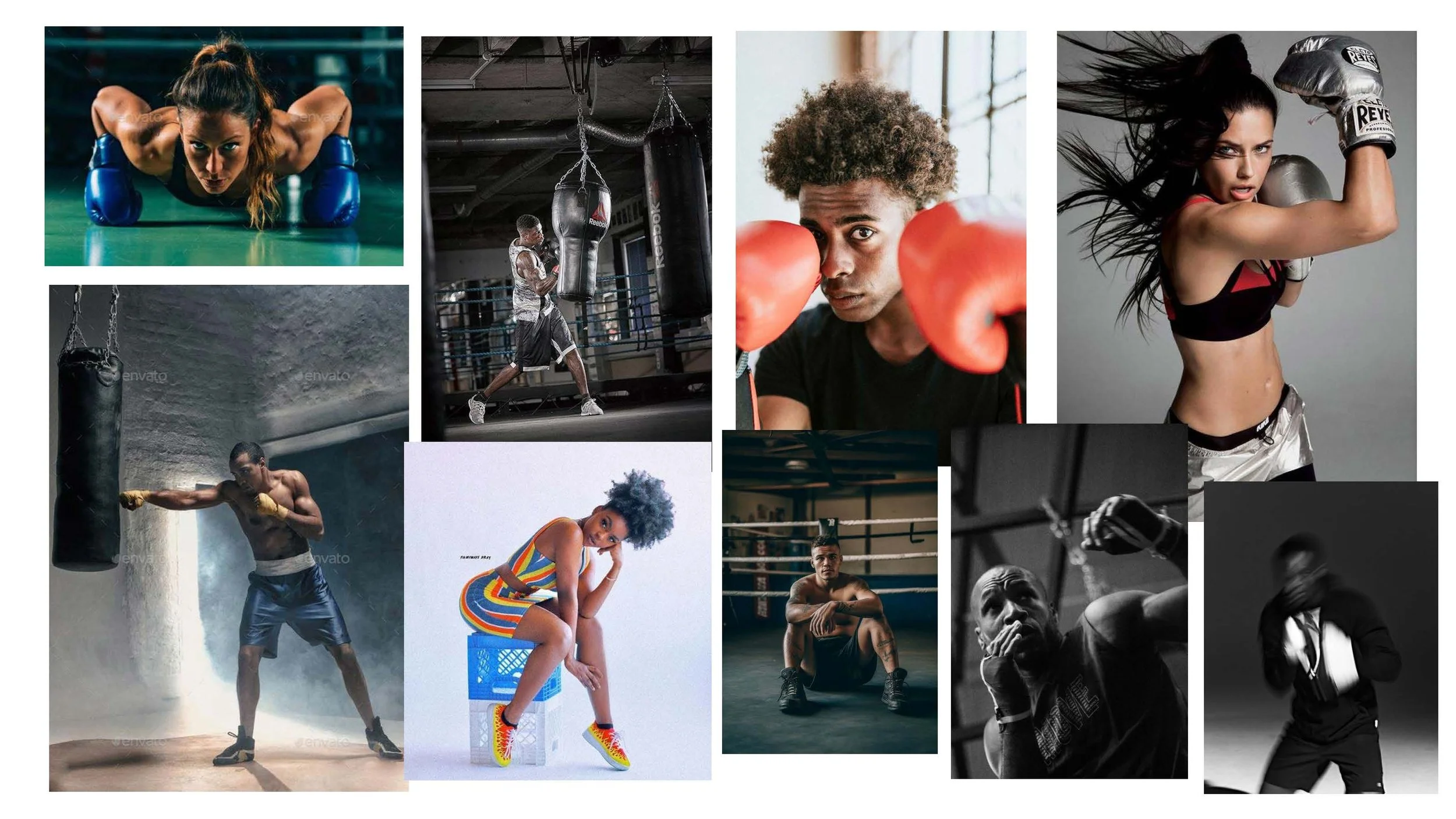
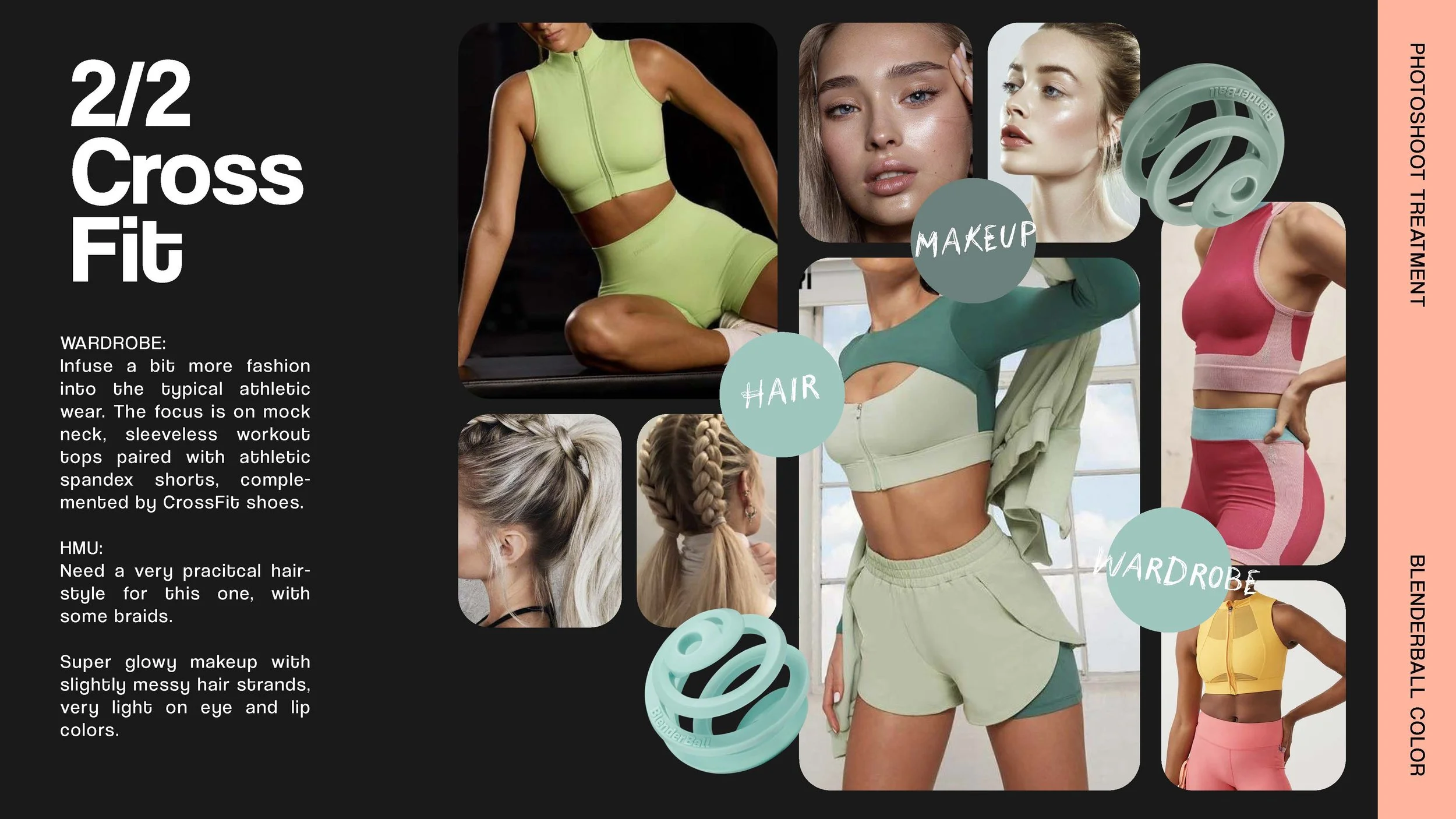
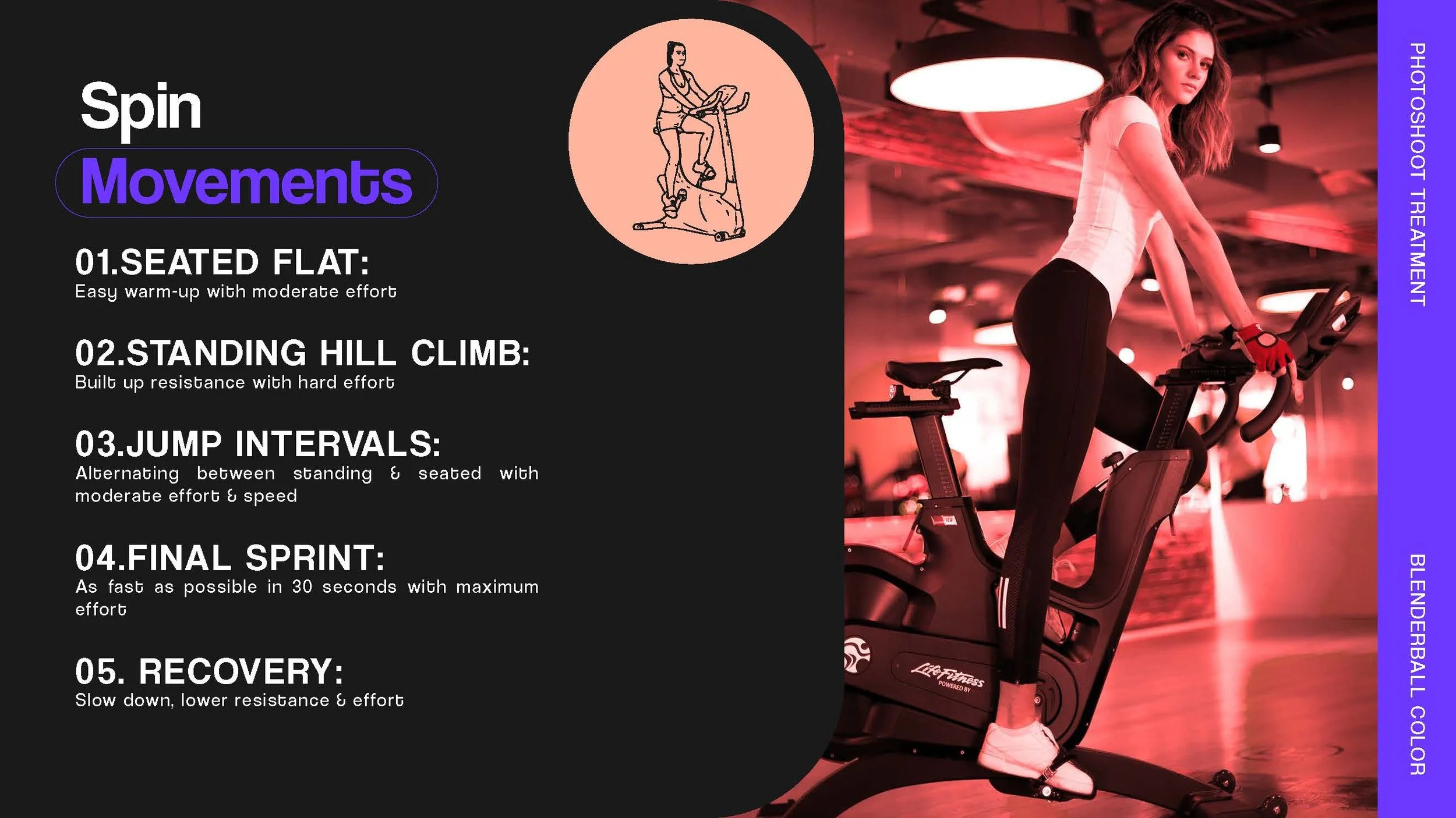
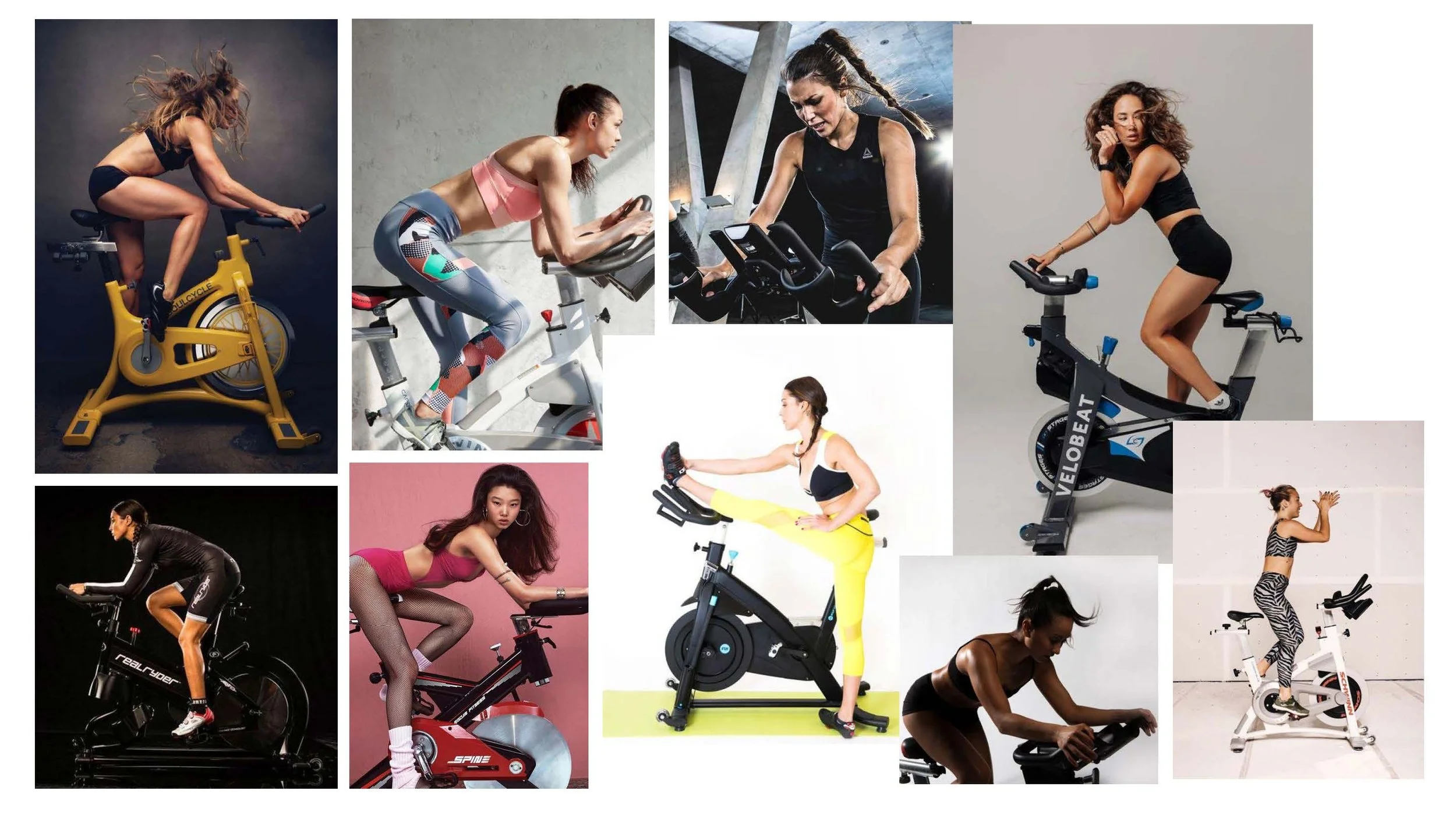
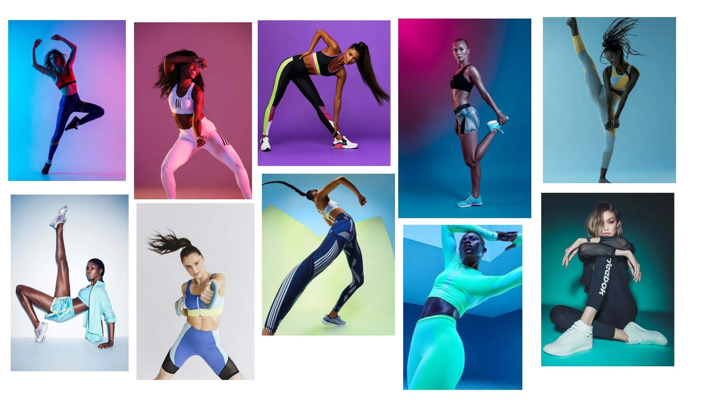
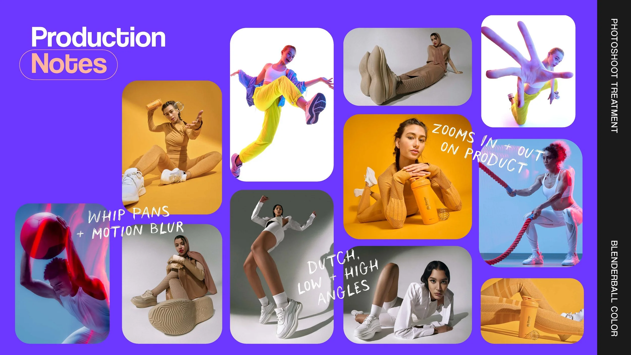
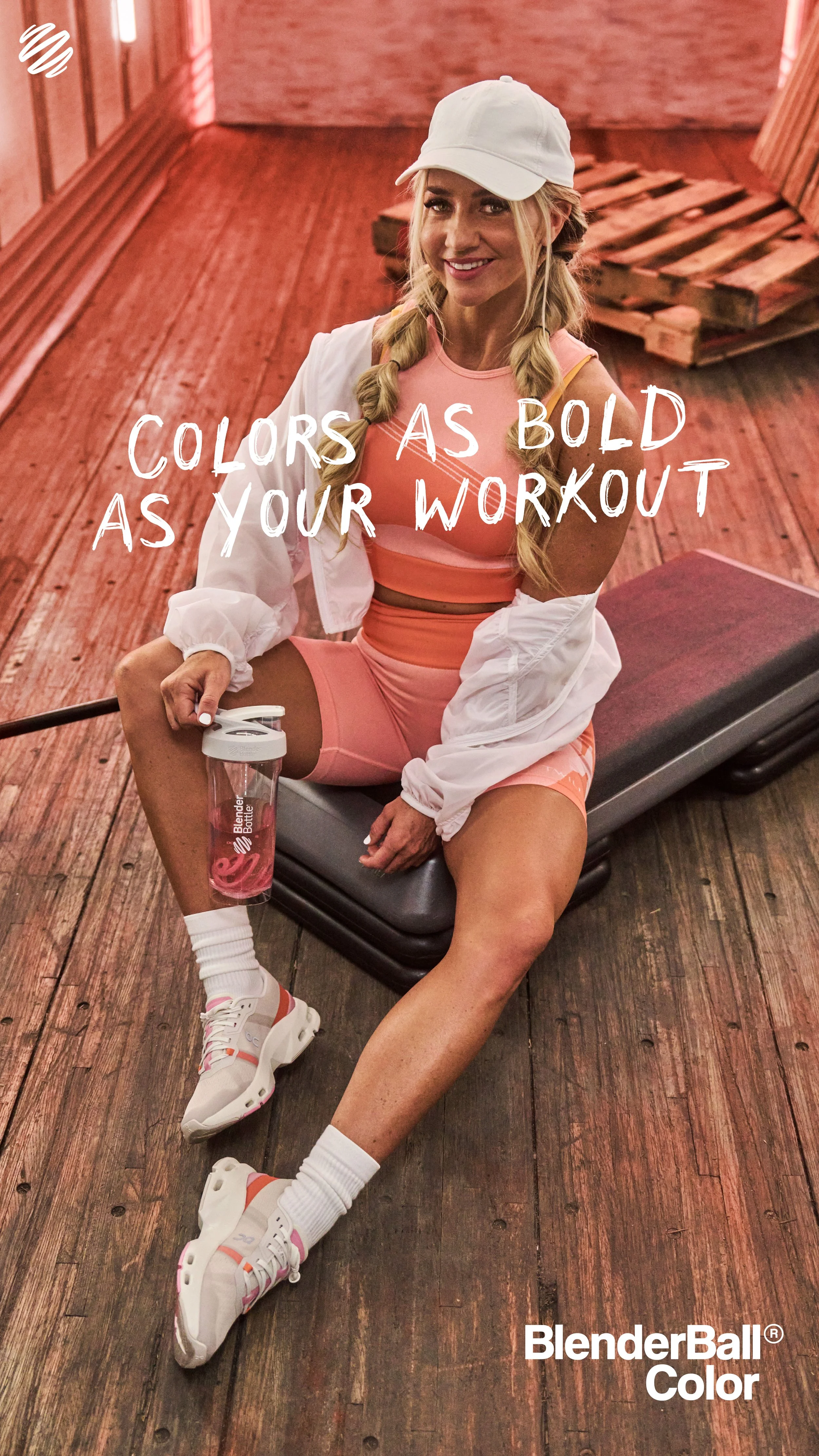
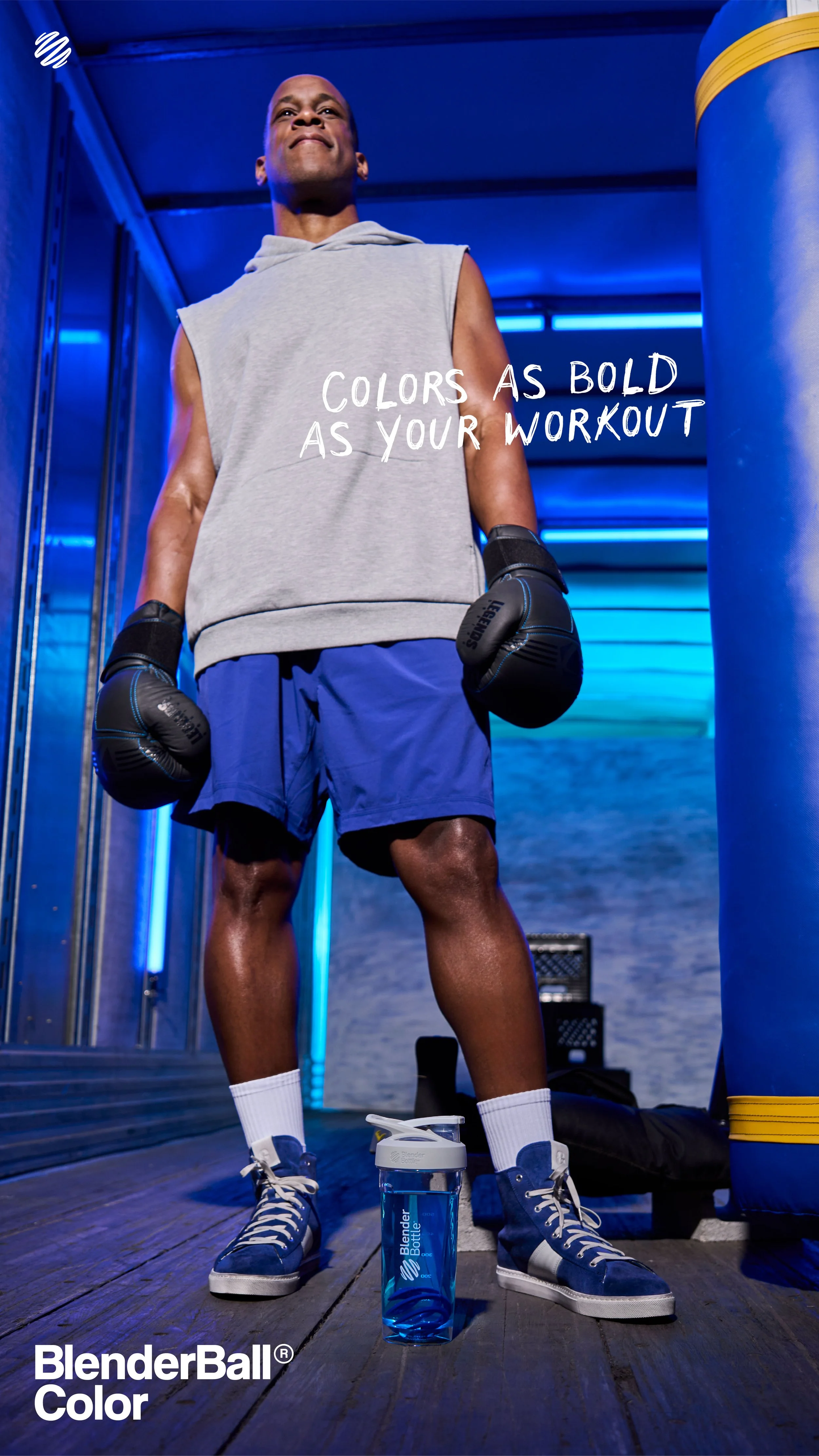
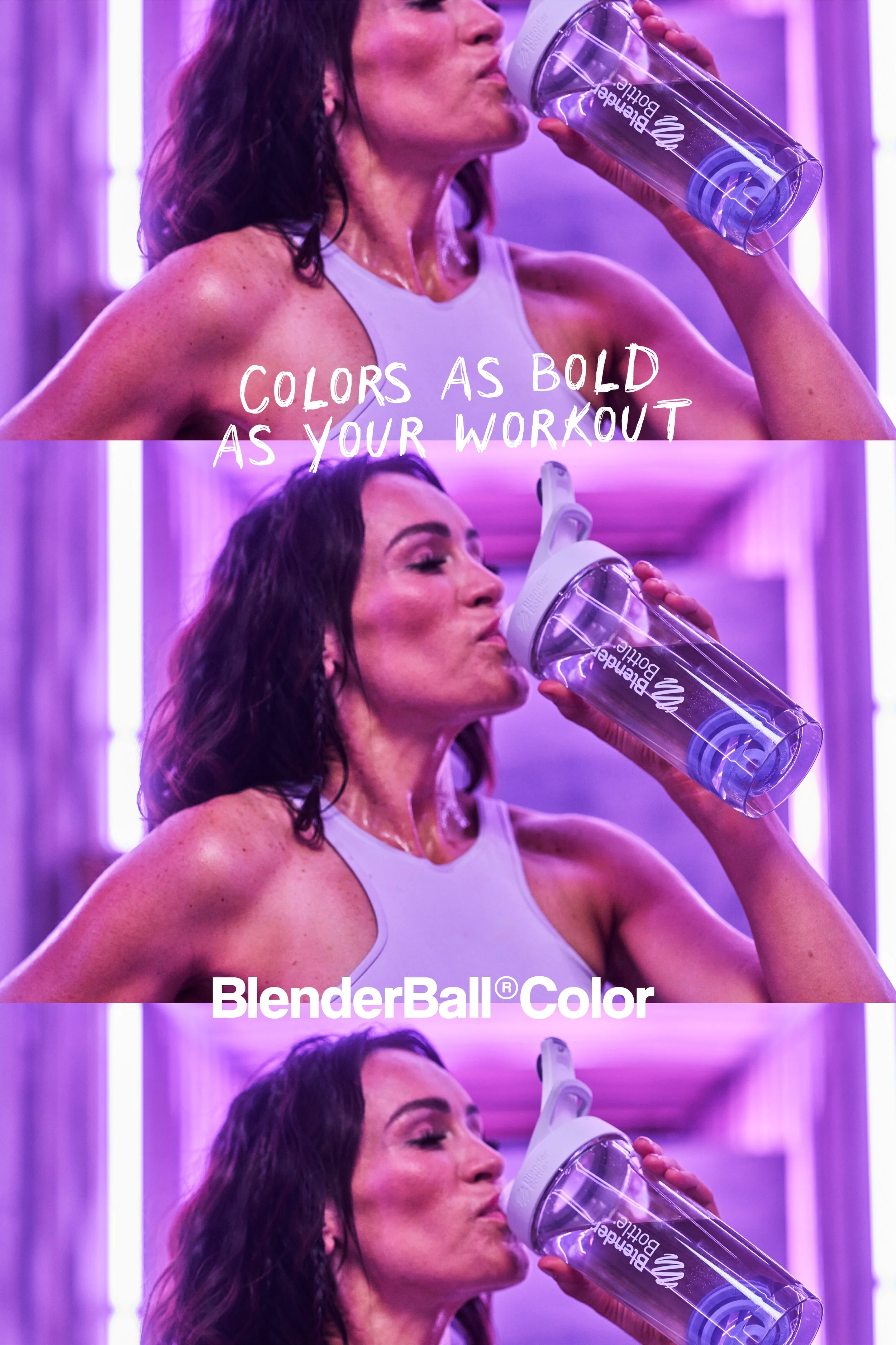
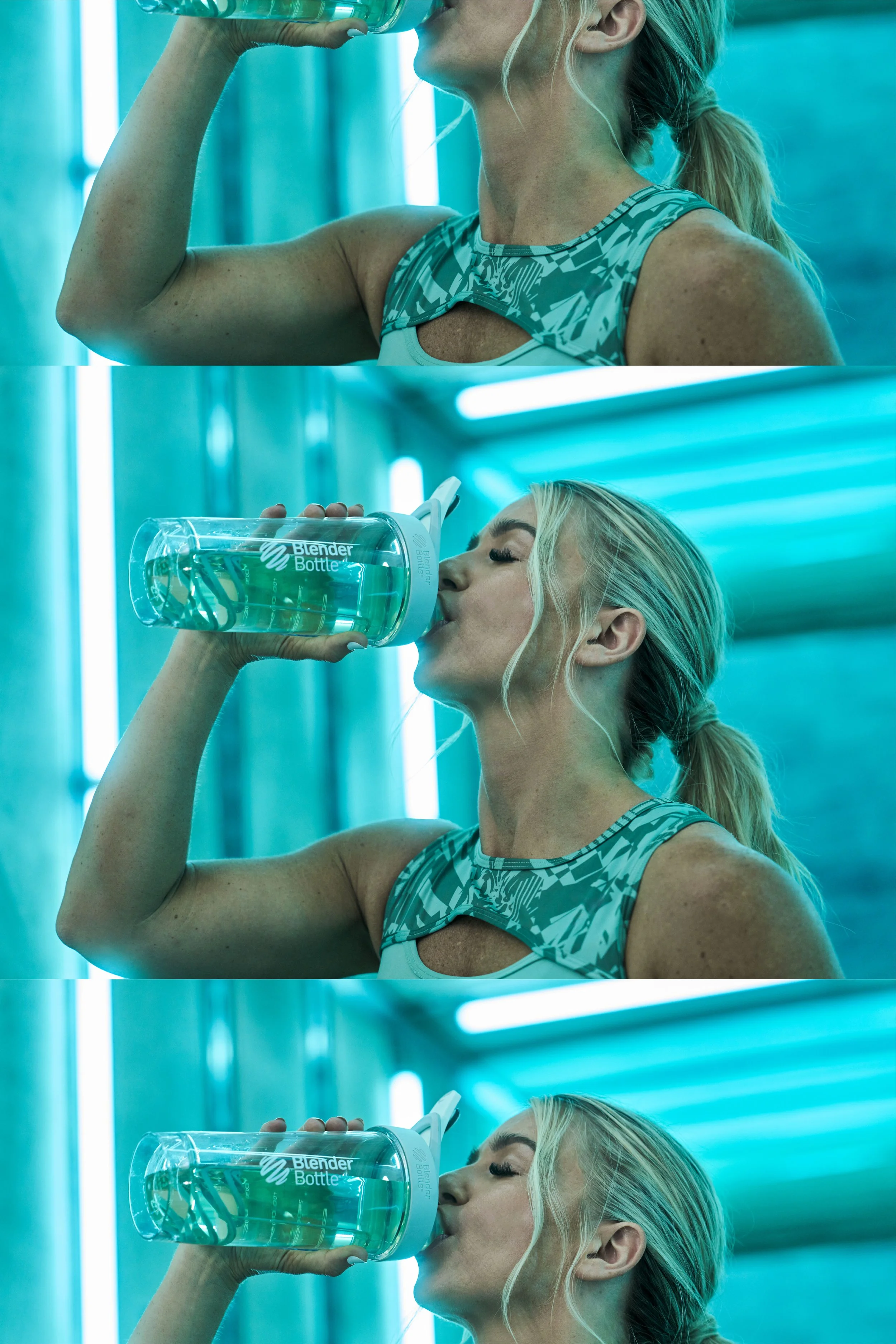
For three days, we worked with three models across six fitness setups, each styled with two distinct looks. The shoot showcased a range of training styles—from weightlifting and crossfit to body pump and zumba—designed to reflect the flexibility and individuality of our audience. Each scene was carefully composed to spotlight the nine new BlenderBall Color variations while reinforcing the brand’s blend of authenticity, performance, and expression.
Wardrobe styling was key to creating standout looks that felt aspirational yet authentic. Each of the three models had two fashion-forward outfits, tailored to their specific workout style—boxing and weightlifting, body pump and CrossFit, Zumba, and spin. We leaned into bold, editorial activewear with a high-impact aesthetic, making sure each look felt like the coolest version of what you could wear to work out. The goal was to elevate performance wear into something visually striking, expressive, and full of personality.
Hair and makeup embraced the grit and movement of real workouts. We opted for glowy, lived-in skin, with minimal but intentional makeup that could hold up under sweat and action. Slightly undone hair and natural shine helped reinforce a sense of realism without sacrificing style. For higher-energy looks like Zumba and body pump, we amped it up with winged eyeliner, bold lips, or vibrant eye colors to match the expressive vibe—striking a perfect balance between polished and raw.
The result was a bold, high-energy campaign that seamlessly blended fashion, fitness, and personality—capturing authentic movement and expression while making every frame feel elevated, dynamic, and undeniably cool.

This is my full document explaining details, inspiration, visual shot list, and further direction for the shoot.

This is my full document explaining details, inspiration, visual shot list, and further direction for the shoot.

This is my full document explaining details, inspiration, visual shot list, and further direction for the shoot.
This is my full document explaining details, inspiration, visual shot list, and further direction for the shoot.

This is my full document explaining details, inspiration, visual shot list, and further direction for the shoot.

This is my full document explaining details, inspiration, visual shot list, and further direction for the shoot.

This is my full document explaining details, inspiration, visual shot list, and further direction for the shoot.

This is my full document explaining details, inspiration, visual shot list, and further direction for the shoot.
This is my full document explaining details, inspiration, visual shot list, and further direction for the shoot.
This is my full document explaining details, inspiration, visual shot list, and further direction for the shoot.
This is my full document explaining details, inspiration, visual shot list, and further direction for the shoot.

This is my full document explaining details, inspiration, visual shot list, and further direction for the shoot.
This is my full document explaining details, inspiration, visual shot list, and further direction for the shoot.
This is my full document explaining details, inspiration, visual shot list, and further direction for the shoot.

This is my full document explaining details, inspiration, visual shot list, and further direction for the shoot.

This is my full document explaining details, inspiration, visual shot list, and further direction for the shoot.

This is my full document explaining details, inspiration, visual shot list, and further direction for the shoot.

This is my full document explaining details, inspiration, visual shot list, and further direction for the shoot.

This is my full document explaining details, inspiration, visual shot list, and further direction for the shoot.

This is my full document explaining details, inspiration, visual shot list, and further direction for the shoot.

This is my full document explaining details, inspiration, visual shot list, and further direction for the shoot.

This is my full document explaining details, inspiration, visual shot list, and further direction for the shoot.
This is my full document explaining details, inspiration, visual shot list, and further direction for the shoot.

This is my full document explaining details, inspiration, visual shot list, and further direction for the shoot.

This is my full document explaining details, inspiration, visual shot list, and further direction for the shoot.

This is my full document explaining details, inspiration, visual shot list, and further direction for the shoot.

This is my full document explaining details, inspiration, visual shot list, and further direction for the shoot.
This is my full document explaining details, inspiration, visual shot list, and further direction for the shoot.
This is my full document explaining details, inspiration, visual shot list, and further direction for the shoot.

This is my full document explaining details, inspiration, visual shot list, and further direction for the shoot.

This is my full document explaining details, inspiration, visual shot list, and further direction for the shoot.

This is my full document explaining details, inspiration, visual shot list, and further direction for the shoot.
This is my full document explaining details, inspiration, visual shot list, and further direction for the shoot.
This is my full document explaining details, inspiration, visual shot list, and further direction for the shoot.
This is my full document explaining details, inspiration, visual shot list, and further direction for the shoot.
Design Execution
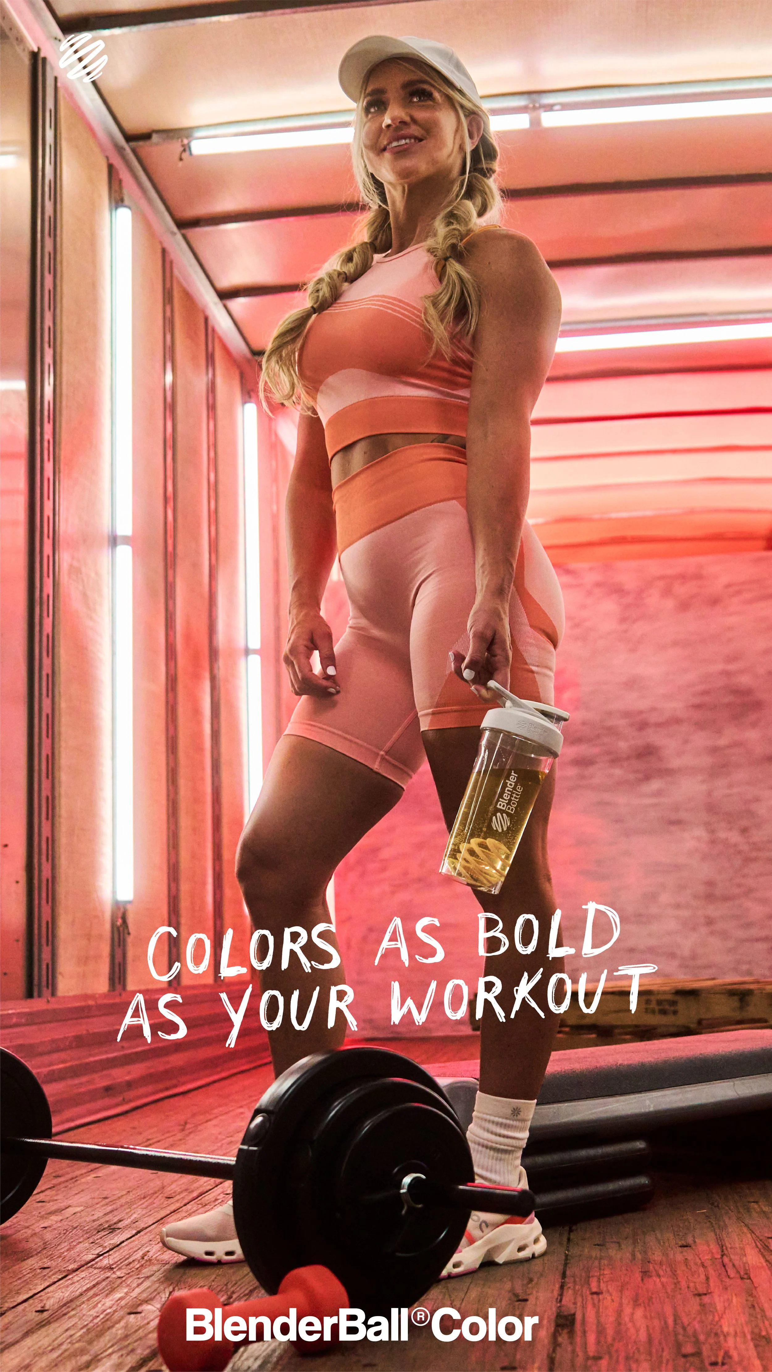
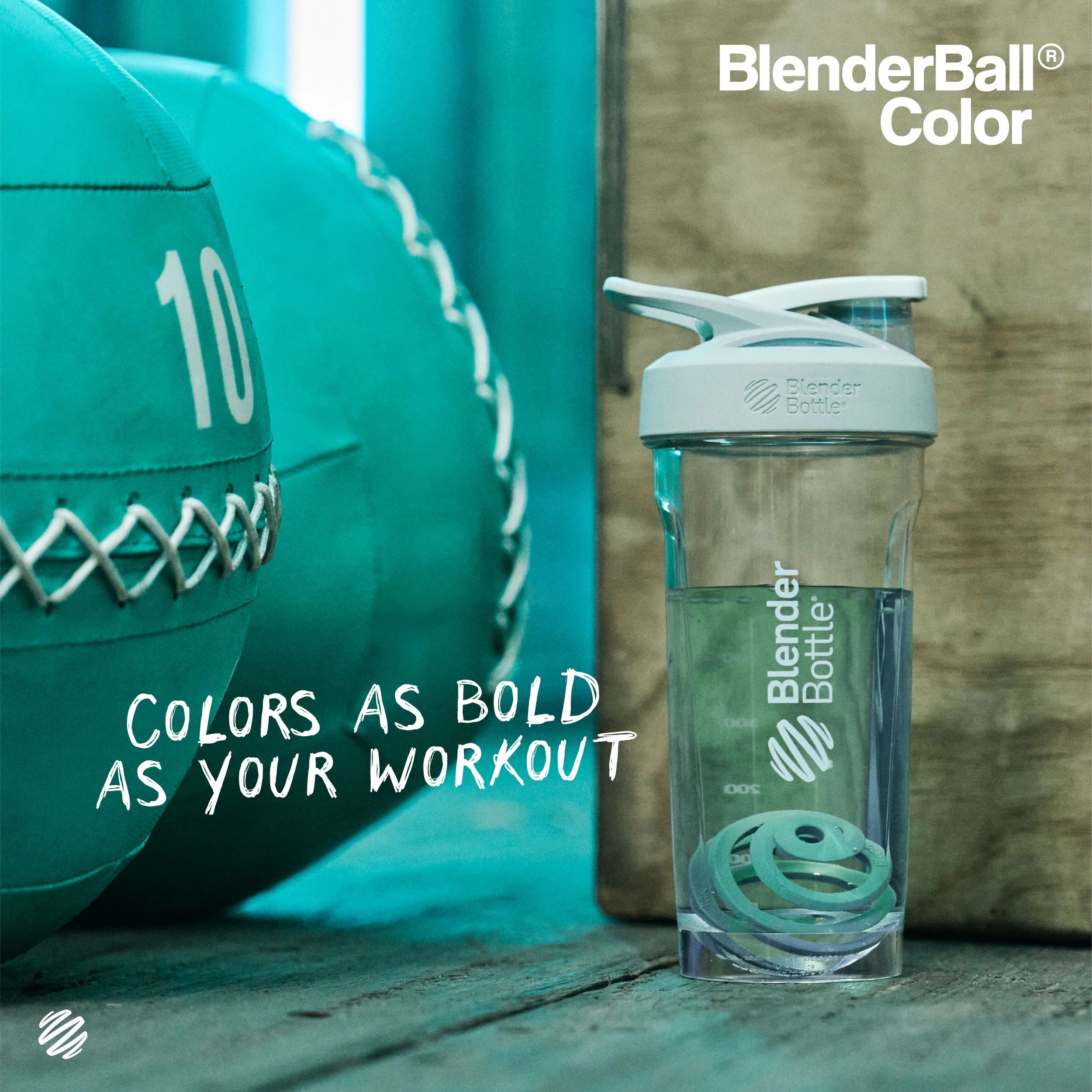
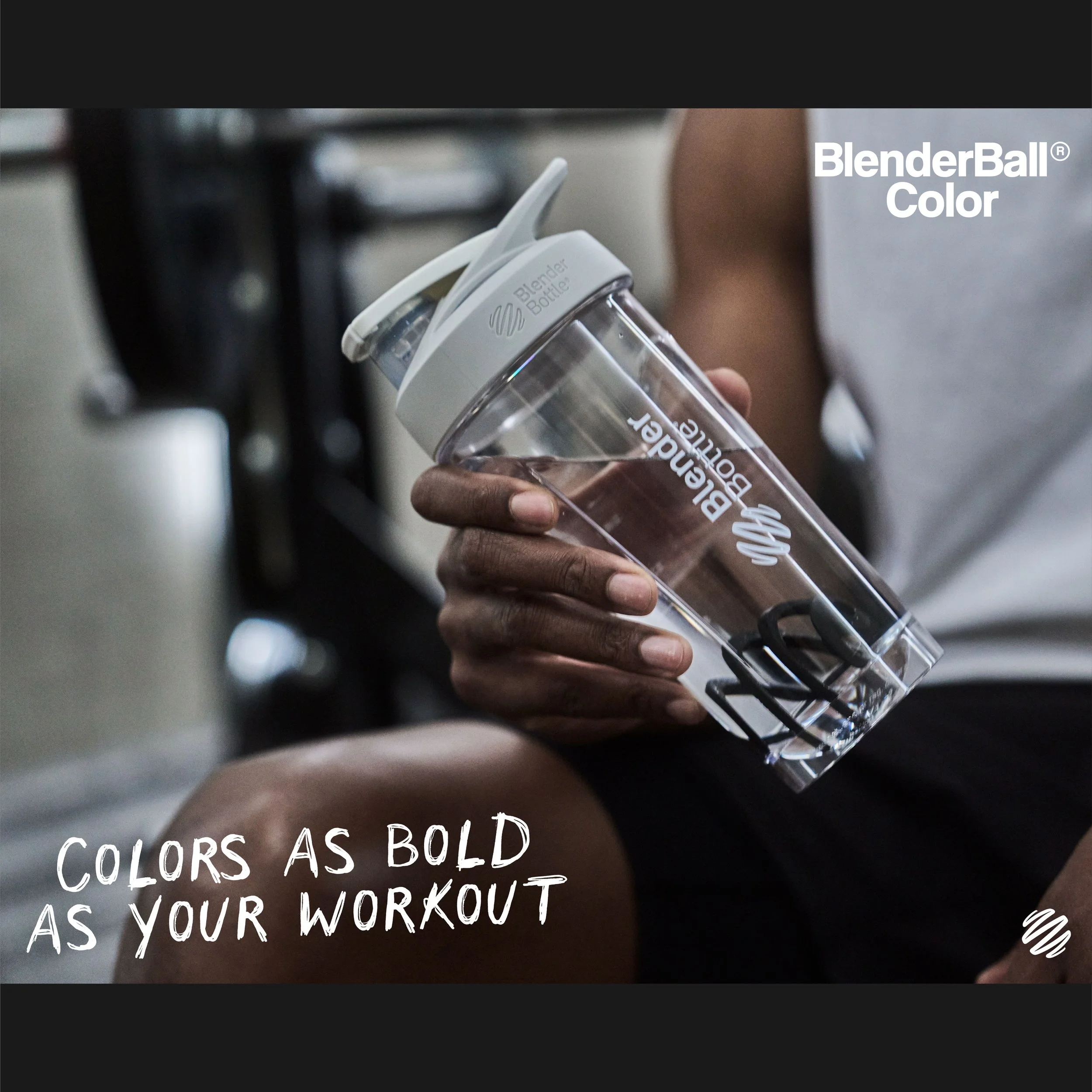
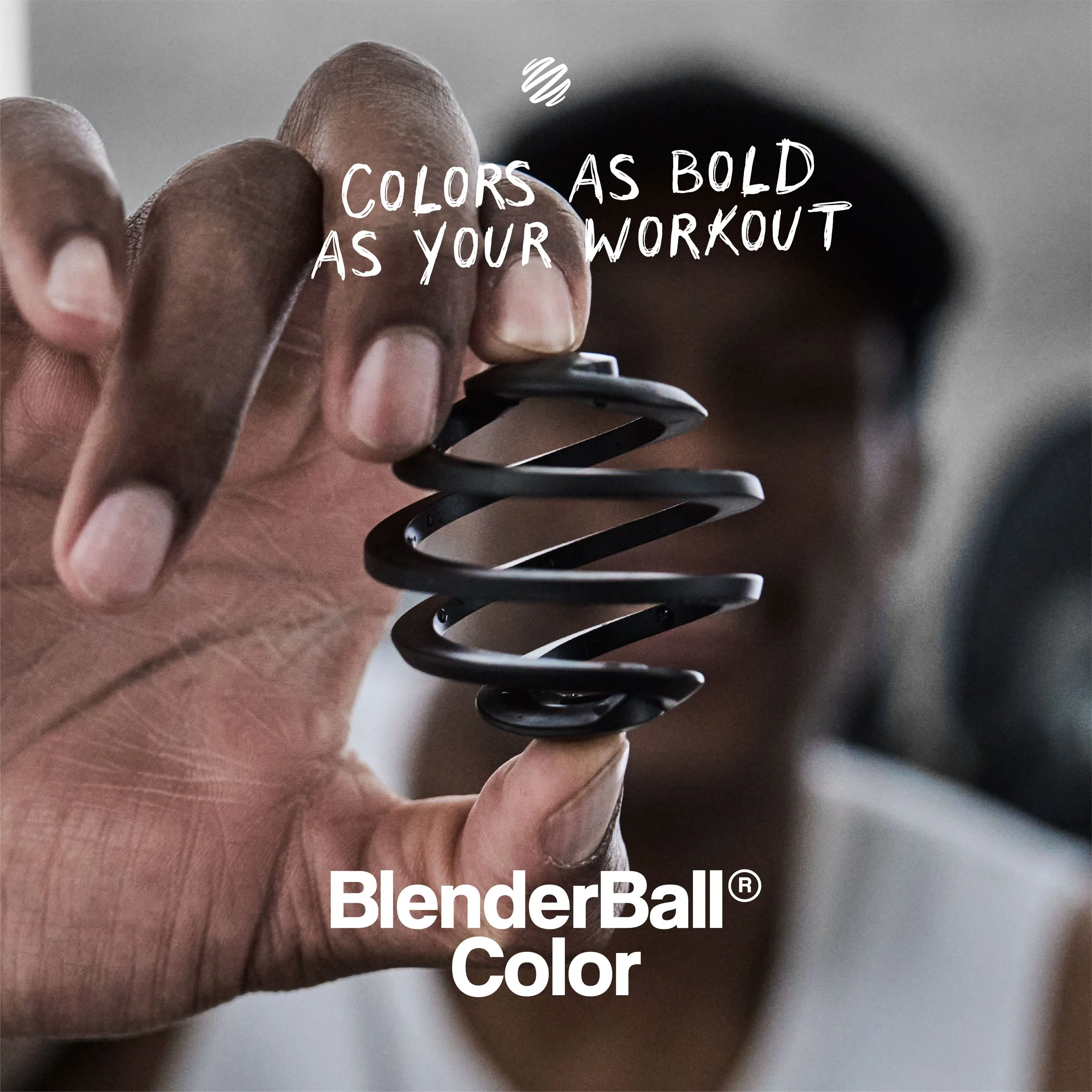
The final design approach paired bold, intentional pops of color with raw, unrefined typography, reflecting the balance between the shoot’s rough-meets-polished aesthetic. Set against the stark backdrop of a wooden trailer, the vibrant BlenderBall® colors became the hero of every frame. The campaign tagline, 'Colors as Bold as Your Workout,' connected the product’s striking palette to the strength and determination of the athletes and everyday users who inspire the brand.
I created a full suite of digital assets including email graphics, social media content, Pinterest ads, Facebook and Instagram placements, and banners for both desktop and mobile. I also contributed to art direction for the launch video and individual bottle videos, ensuring consistency across motion and static content. Additionally, I handled all post-processing of campaign images—color correcting, retouching, cropping, and preparing final exports for use across the company’s platforms.


Project Result:
The project debuted the first-ever plastic BlenderBall® in nine bold color options, transforming a core functional component into a customizable accessory. This expansion invited customers to mix, match, and accessorize their bottles in a way that felt fresh, playful, and deeply personal. The vibrant palette and launch campaign received strong internal praise and sparked excitement within the brand’s community, paving the way for future explorations in color, material, and accessory design. It marked a shift toward treating every element of the product as an opportunity for self-expression
The Team:
Art Director: Stauney Hansen
Creative Media Director: Riley Sorenson
Producer: Janelle Corey Production Asst. Kennedy Henry
Director of Photography: Jeff Yeats, Assistant DP: Sam Wood
Lead Photographer: Blake Tolley, Photo Assistant: Luke Tolley
2nd AC: Genji Li, Gaffer: Tyler Davies
Wardrobe Stylist: Janelle Corey, HMUA: Cami Talbot
Talent: Wuta Beta, Mikail Jenkins, Amy Davis
Video Editor: Garrett Elton, Jordan Boren
Location: Trove Brands Warehouse, Lehi, UT